Charts and Cards
Memfault charts allow you to proactively monitor any smart device, anywhere. Monitor your releases and view data-driven device and fleet-level metrics, like battery health, connectivity, stability and more in real-time dashboards.
Creating & Editing Charts
To create a new chart, navigate to the dashboard you want to add the chart to. Check out Dashboards to learn more about creating and managing dashboards.
Click the Create Chart menu in the top-right corner of the page and select the
type of chart you want to create.
Existing charts can be edited by clicking the blue pencil icon in header of the card containing the chart.
Copying Charts & Cards
You can copy a card from one dashboard to another. To do so, open the editing modal for the card you want to copy by clicking the blue pencil icon in the header of the card. Next, click "Copy" in the top right corner of the modal. Select the dashboard you want to copy the card to and click "Copy".
Metric Charts
Memfault indexes and aggregates the metrics collected by your devices to provide you not only with insights of how individual devices are performing, but also the emergent behavior of your entire fleet. These metric aggregations are available in all versions of the Memfault SDK.
You can add charts to visualize these aggregated, fleet-wide metrics by navigating to the sidebar and selecting Dashboards → Metrics.
Creating a new chart is as simple as clicking Create Chart => Generic =>
Metric Chart from the dropdown menu selecting your metric of interest, and
choosing the desired aggregation type. Also see video below. Note that only
metrics configured as Timeseries can be
used in Metric Charts.
Metric chart configuration options are described in detail more below:
Y-Axis
The name suggests it already: the Y-Axis selects what to show on the vertical axis of the chart. Theses options are available:
We'll go into more detail on each of these options below.
Aggregation of Metrics
The list of metrics available in your project is automatically created from the metrics collected by your devices. For that reason, at least one device must upload data for a given metric before a chart for that metric can be created.
| Aggregation | Description | Rollup Availability | |
|---|---|---|---|
| Over-Time | By Cohort or Software Version | ||
| Min | The lowest reading received. | ✅ | ❌ |
| Mean | Arithmetic mean of all readings. | ✅ | ❌ |
| Max | The highest reading received. | ✅ | ❌ |
| Min/Mean/Max | All of the above combined into a single chart. | ✅ | ✅ |
| Percentiles | Distribution of values (p01, p05, p50/median, p95 and p99). | ✅ | ✅ |
| Count | Number of times a value was received. | ✅ | ❌ |
| Sum | Sum of all readings. | ✅ | ❌ |
The values to be aggregated can be filtered using the "Segments" options.
For more information about adding metrics to your devices:
- Bare Metal/RTOS: see the Metrics Guide
- Android: update to the 3.0+ version of the Android SDK
- Linux: see the Metrics Guide
Report Count
The "Report Count" option will show a count of reports that have been received. The reports to include can be configured using the "Segments" options.
Device Count
The "Device Count" option will show a count of unique devices for which matching reports have been received. The reports to include can be configured using the "Segments" options.
Rollup
The "Rollup" option selects whether the data should be aggregated over time or not:
| Purpose | Description | |
|---|---|---|
| Over Time | This rollup is useful to show trends over time. For example: uptake of a new product feature during a marketing campaign, or showing stability over time. | The data of each segment is aggregated over time. The chart's X-axis is used to represent time. The time range and granularity of buckets can be selected from the chart's card. |
| By Cohort or Software Version | This rollup is useful to compare data of all-time from different segments or populations of data against each other. For example: comparing the stability of different software versions, or comparing the battery life between production and beta cohorts. | All-time data (after applying filters) is aggregated for each segment and plotted in a way that makes comparison between segments easy. Please note that this particular type of chart only supports the "Min/Mean/Max", and "Percentiles" aggregation methods. |
Below are a few examples of metric charts "Over-Time" (left) and "By Software Version/Cohort" (right). The top row is showing the "Min/Mean/Max" aggregation mode and the bottom row is showing the "Percentiles" aggregation mode:

Segments
Using segments, you can create charts that plot the same metric for different subsets of the data. For example, based on the type of activity that the device is performing. The example chart below has 2 segments: "Running" and "Swimming".
A segment defines a subset of the data to be included in the chart. Each segment selects data from one or more Metric Report types. Furthermore, each segment can specify additional filtering conditions, using other timeseries metrics in the same report to filter the data by.

Both segments source from voice-command Metric Reports. A workout_kind
timeseries metric is used to record the kind of workout being performed. A
condition on that metric is added to each segment to filter the data:

Creating Segments
All Metric charts are created with one segment by default. To add more segments, click the "Add Segment" button. You can also use the "Duplicate this segment" button to easily derive one segment from an existing one. Up to 4 segments can be created. If you need more, we recommend creating separate charts.
We recommend giving each segment a short but descriptive name to make it easier to understand the chart.
Selecting Reports
Use the "Report Type" drop down to select which reports you would like to include in the segment. You can add more using the "Add Report Type" button. It is possible to use session reports, but also Heartbeat reports, although it usually does not make sense semantically to mix them. Read more information about heartbeats, sessions and reports, here.
Adding Conditions
Optionally, a segment's data can be further filtered by adding conditions on other metrics. Limitations:
- Only "Over-Time" charts support conditions. "By Cohort or Software Version" charts do not support this.
- Only metrics configured as Timeseries can be used in conditions.
- Multiple conditions are AND'ed together.
- Up to 3 metrics can be used in a single segment's conditions. This includes
the metric being charted. For example, a chart that aggregates the
"Min/Mean/Max" of metric
step_count. Aside ofstep_count, 2 other metrics may be used in conditions. That said, it's possible to add any number of conditions with those 3 metrics.
Segment Colors
Optionally, a segment can be assigned a color using the color picker. By default, each segment is auto-colored (indicated by a white swatch with red diagonal line). The color picker can be accessed by clicking on the color swatch. If "Auto-color" is used, the next available color will be assigned automatically.

Segments × Dashboard filters
Each dashboard also provides a filter panel at the top of the page where data can be segmented along different dimensions compared to chart segments.
When a chart has multiple segments and the dashboard has multiple filters applied, a cartesian product of the segments and the dashboard filters is created.
For example, continuing on the example from above, if the dashboard filter panel is set up to compare the "Production" Cohort with the "Test" Cohort, the chart, will show 4 bars for each day:
- A: "Running" & "Production"
- B: "Running" & "Test"
- C: "Swimming" & "Production"
- D: "Swimming" & "Test"

Issue Charts
Issue Charts allow you to visualize issues and traces in a variety of ways. There are 2 ways to create Issue Charts:
-
From an Issue search query: this is useful for tracking the number of issues or traces for a set of issues matching specific criteria. To create an Issue Chart from a search, navigate to the Issues page and add the desired filters. Then click the "Create Dashboard Chart" button.
-
From specific Issue IDs: this is useful for tracking the number of traces for a specific issue over time. To create an Issue Chart for a specific set of Issues, navigate to the dashboard and click "Create Chart" → "Stability" → "Issue Chart". Enter the Issues you want to track under "Specific Issues".
Trace Count Over Time
This shows the number of times a problem occurred over the past days, weeks. This chart can be focused to a single issue, a set of issues or an issue search query to allow you to monitor the impact of a specific problem.

New Issue Count Over Time
A trace is an individual occurrence of a problem, whereas an Issue is a group of similar traces. This chart visualizes the count of new issues over time. Trace counts are useful for seeing the prominence of problem, while new issue counts are useful for viewing if new types of problems are happening in your fleet.
Top 5 Issues
Top 5 issues charts allow you to view a table of issues sorted by count of number of traces, number of affected devices, first seen or last seen date of the issue. This rollup is beneficial for identifying what are your oldest, most recent, and biggest impact issues.

Trace Count Summary
This shows the percentage number of times a problem occurred, per different Issue or an Issue Reason. You can use this to compare the distribution of issues or reasons between different populations. Table can be sorted for a given segment columns Trace count.

Issue Count Summary
This shows the percentage number of times a problem with a different Issue Signature has occurred, per different Issue Reason. You can use this to compare the distribution of reasons between different populations. Table can be sorted for a given segment columns new Issue count.

For more information on the differences between issues and traces we recommend reading What is an issue?.
Impacted Devices Summary
This shows the percentage number of devices that have been impacted by a problem, per different Issue Reason, Issue ID, Software Type or Hardware Version. You can use this to compare the distribution of reasons between different populations. Table can be sorted for a given segment columns Impacted Devices percentage.

Reboots and Crashes Charts
The built-in Reboot Reasons and Crashes per 10,000 Hours charts are a great way of comparing the stability of different software versions, or over time.
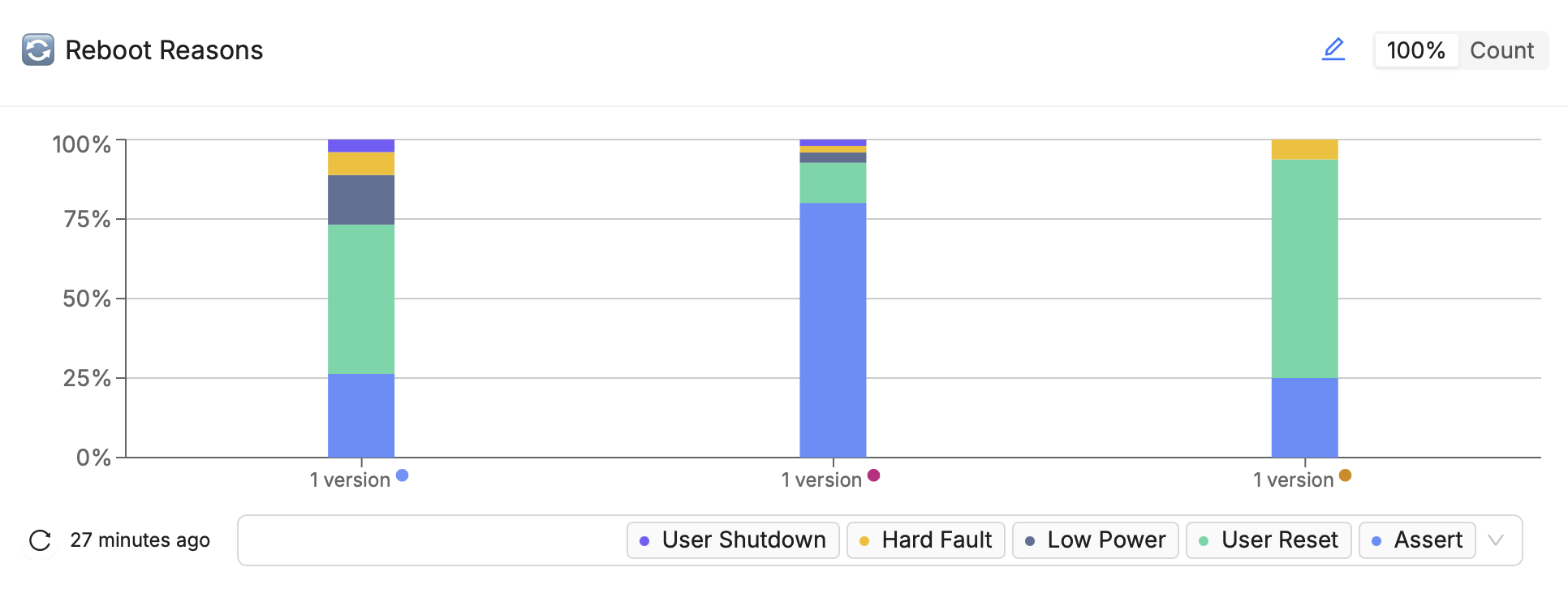
Reboot Reasons
The Reboot Reasons chart can be used to compare the relative occurrence of all reboots or specific types of reboots across different software versions.
Use the toggle in the top right or hover over the tooltip to see the absolute data.
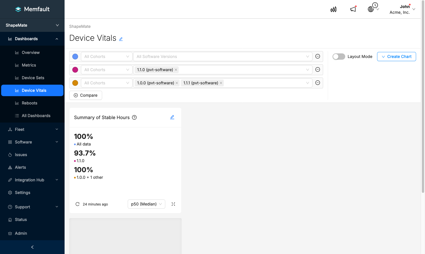
Device Vitals Cards
The built-in Device Vitals Cards show various insights based on core metrics collected by the Memfault SDKs. These cards allow you to quickly understand how the average device in your fleet is performing, using three device health concepts that are applicable to a wide range of devices.
Creating Device Vitals Cards
To add a Device Vitals Card, click the Create Chart button in the top-right
corner of a dashboard page and select the relevant option:
- Stability ->
- Connectivity ->
- Battery ->
- Flash Wear ->
Each of the card types are described in more detail below.
Filtering & Segmentation
Like Metric Charts, Device Vitals Cards supports Segments to select and filter data based on the report type and metric conditions. See this section for more information on the topic of segmentation.
These cards can also be filtered by software version(s) to compare device health between different releases or sets of devices.
Drilldowns
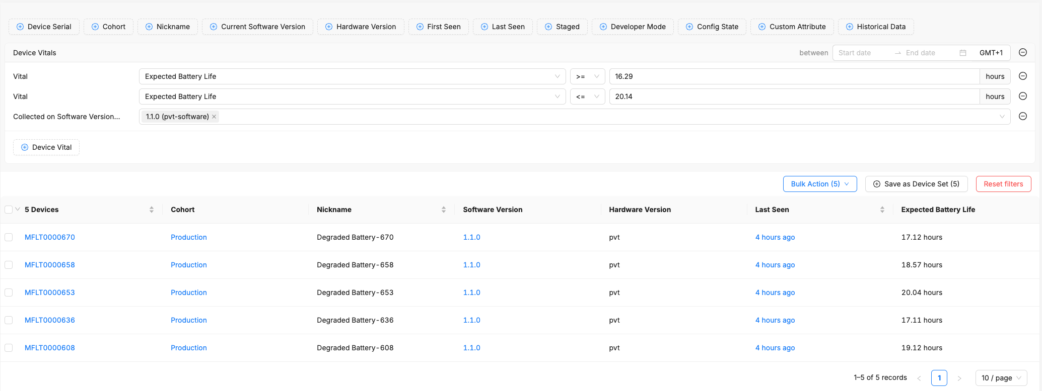
To view what devices are represented in specific ranges of Device Vital charts, click on the section in the chart to "drill down" into it. When you drill down to a range from the chart, you will be navigated to a pre-filtered Device Search page.
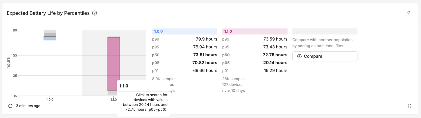
On the Device Search page you can see the specific devices and their aggregated value of the selected device vital. From here you can navigate to a specific device, or adjust filters to further refine and narrow your search.
Stability
Stable Hours
The Stable Hours card displays the total time a device operated without crashing or experiencing an unexpected reboot.
Note: this card can only be used with heartbeat reports. See Stable Sessions below for the equivalent card, but suitable for session reports.
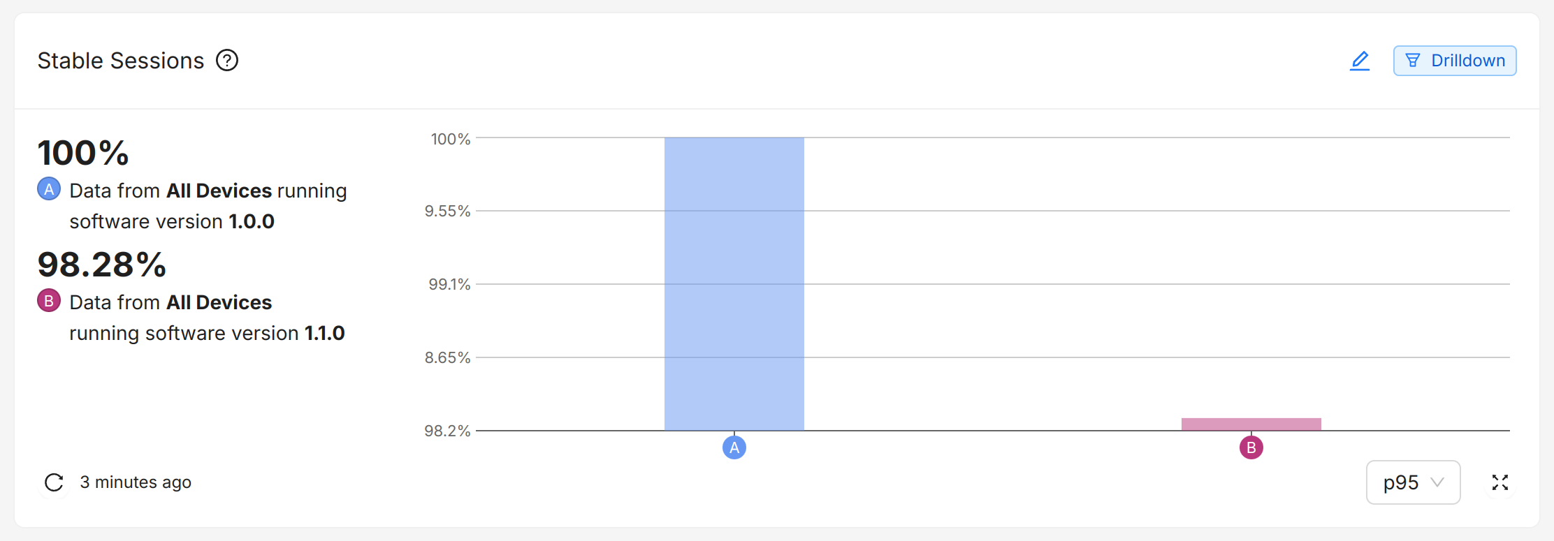
Stable Sessions
The Stable Sessions cards shows how many sessions are crash-free.
Note: this card can only be used with session reports. See Stable Hours above for the equivalent card, but suitable for heartbeat reports.
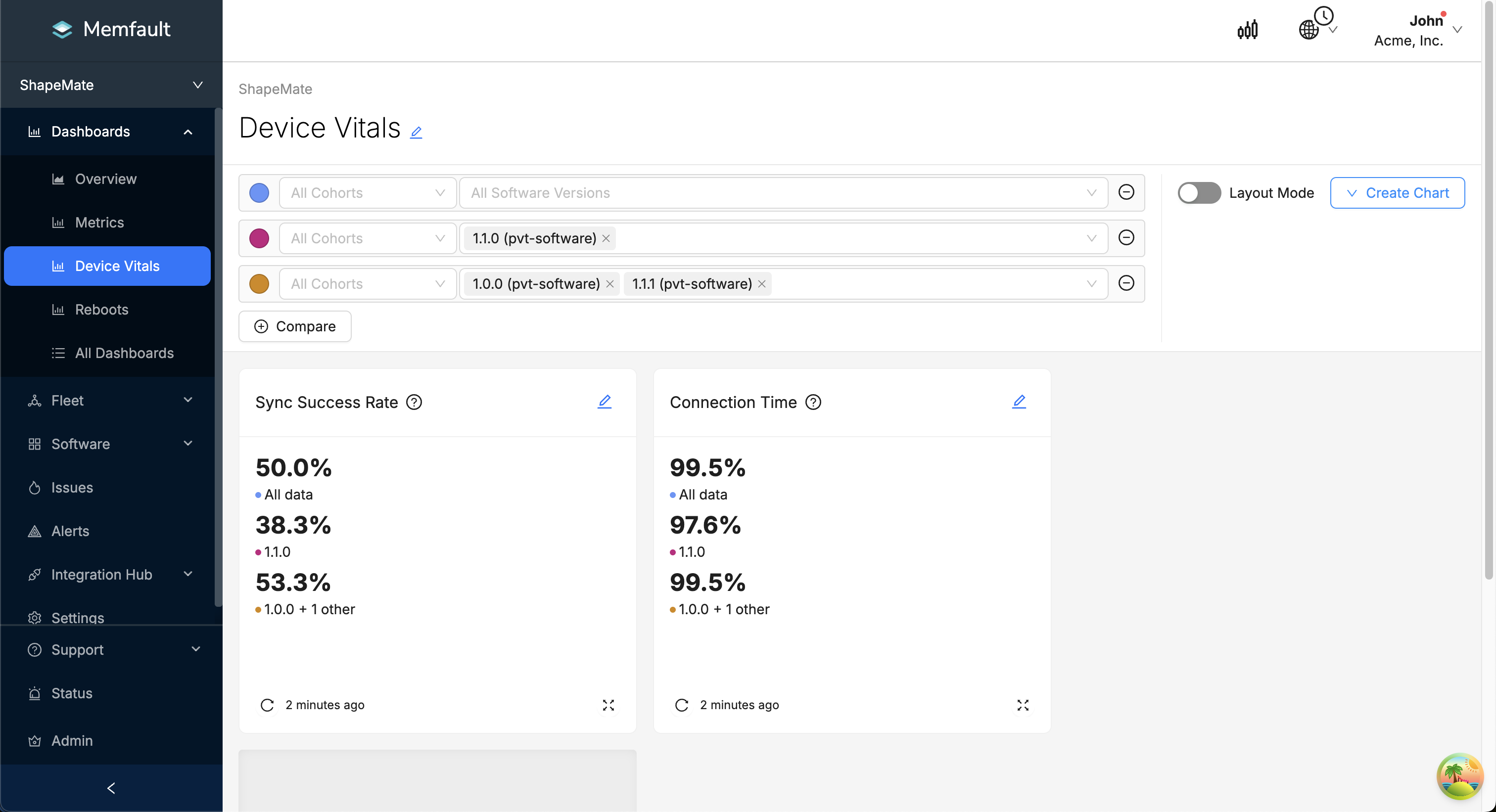
Connectivity
The Connectivity cards show how well the median device in your fleet stays connected, whether your devices perform discrete data sync operations or maintain continuous connections.
Connected Uptime (Always-On Connectivity)
The Connected Uptime chart shows how much of the expected uptime is spent connected.
Sync Success (Periodic Connectivity)
The Sync Success card shows how often a data sync operation succeeds.
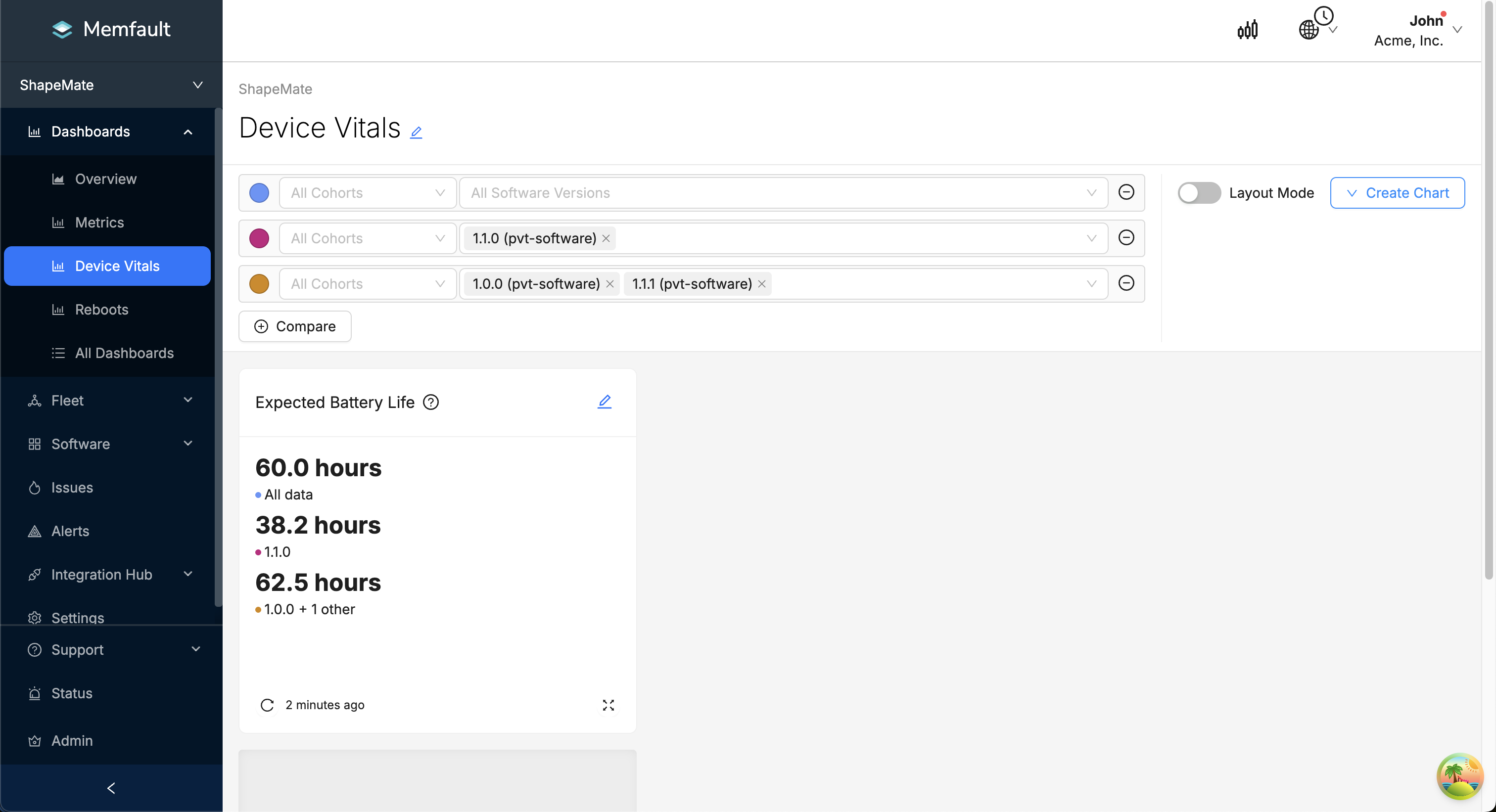
Expected Battery Life
The Expected Battery Life card shows how long the battery is expected to last for the median device.
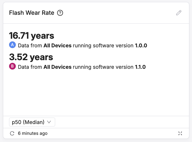
Flash Wear
The Flash Wear charts and cards show how quickly devices are wearing out their flash, and how much lifetime is remaining.
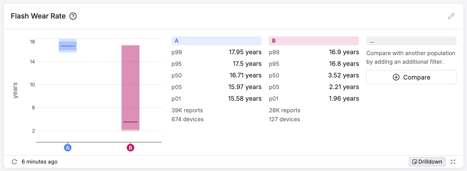
Flash Wear Rate Summary
The Flash Wear Rate Summary card shows the rate of flash wear. This chart is useful for identifying changes in flash wear across releases:
Flash Wear Rate Percentiles
The Flash Wear Rate Percentiles chart shows the distribution of the flash wear rate across the fleet. This chart is useful for seeing the spread of rates, and identifying outliers:
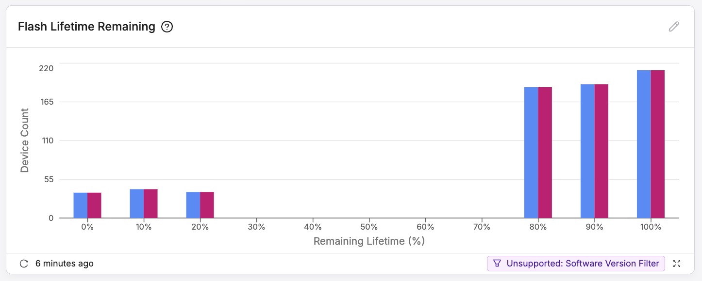
Flash Wear Lifetime
The Flash Remaining lifetime chart shows the distribution of remaining lifetime across the fleet. This chart is useful for seeing the spread of lifetime, and identifying devices that may be reaching the end of their flash life:
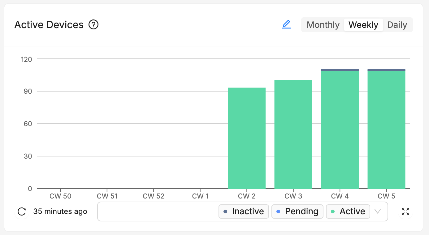
Active Devices Chart
Active devices Chart shows the number of active devices in your fleet over time. This chart is useful for tracking the growth of your fleet and can be used to identify trends.
- Pending devices have been created in Memfault but have not yet contacted Memfault.
- Active devices have contacted Memfault on the given week.
- Inactive devices have previously contacted Memfault, but not on the given week.
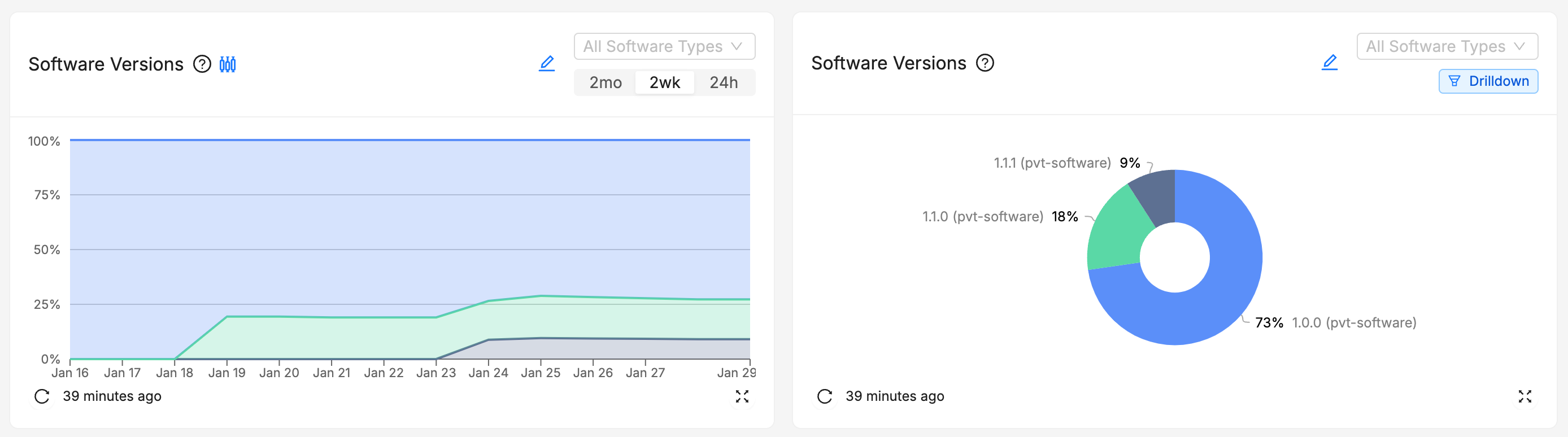
Software Versions Chart
The Software Versions chart shows the distribution of software versions across your fleet. This chart has 2 modes:
- Current
- Over Time
While the Current gives you a deeper look into the distribution of software versions in your fleet at this moment, the Over Time mode allows you to track the evolution of the distribution of software versions over time. This chart is useful for tracking the adoption of new software versions and can be used to identify trends.
Attribute Distribution Chart
The Attribute Distribution chart shows the distribution of an Attribute across your entire fleet, at the latest point in time.
This chart is useful for understanding trends of the top attribute values in the fleet.
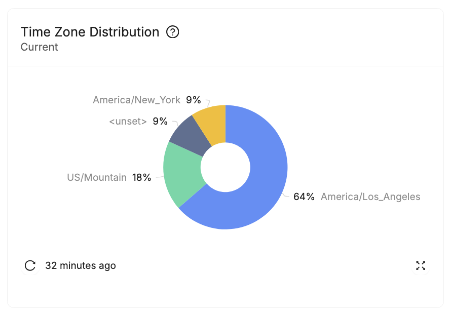
- Devices that have not recorded a value for the Attribute will report as
<unset>. - Only the top 10 attribute values will be shown (by number of devices reporting
that value). The remaining values are grouped into
<other>.
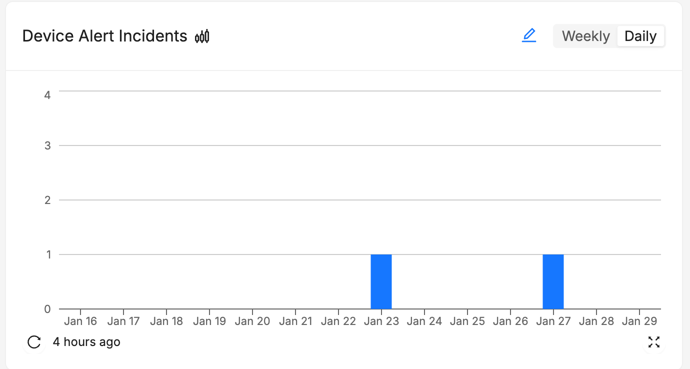
Device Alert Incidents Chart
The Device Alert Incidents chart shows the number of device alerts that have occurred in your fleet over time. This chart is a good way to track number of incidents.
Received Bug Reports Chart
This chart is only available for Android devices.
The Received Bug Reports chart shows the number of bug reports that have been received by Memfault over time. This chart does not have any other configuration options.
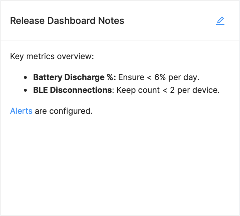
Markdown Cards
You can add Markdown Cards to your dashboard to add context to your charts and
dashboards. To add a Markdown Card, click the Create Chart button in the
top-right corner of the page and select Create Markdown Card. These cards
support full markdown syntax and can be used to add text, images, and links to
your dashboard.
LaTeX Support
Markdown Cards support LaTeX syntax for mathematical expressions. To use LaTeX,
either use a block annotated with math:
```math
  ... LaTeX here ...
```
Or use inline LaTeX by wrapping the expression in $:
$... LaTeX here ...$
Device Sets
It is often useful to search for devices that fulfill certain criteria and to keep track of the number of matches over time. Examples of this could be searching for devices that:
- have not communicated with Memfault within the last N days,
- are running a deprecated software version, or
- are reporting a metric over a critical threshold.
This kind of follow-up can easily be done by defining a Device Set, which will do a daily tally of a search query of your choice, and present it to you in a graph:
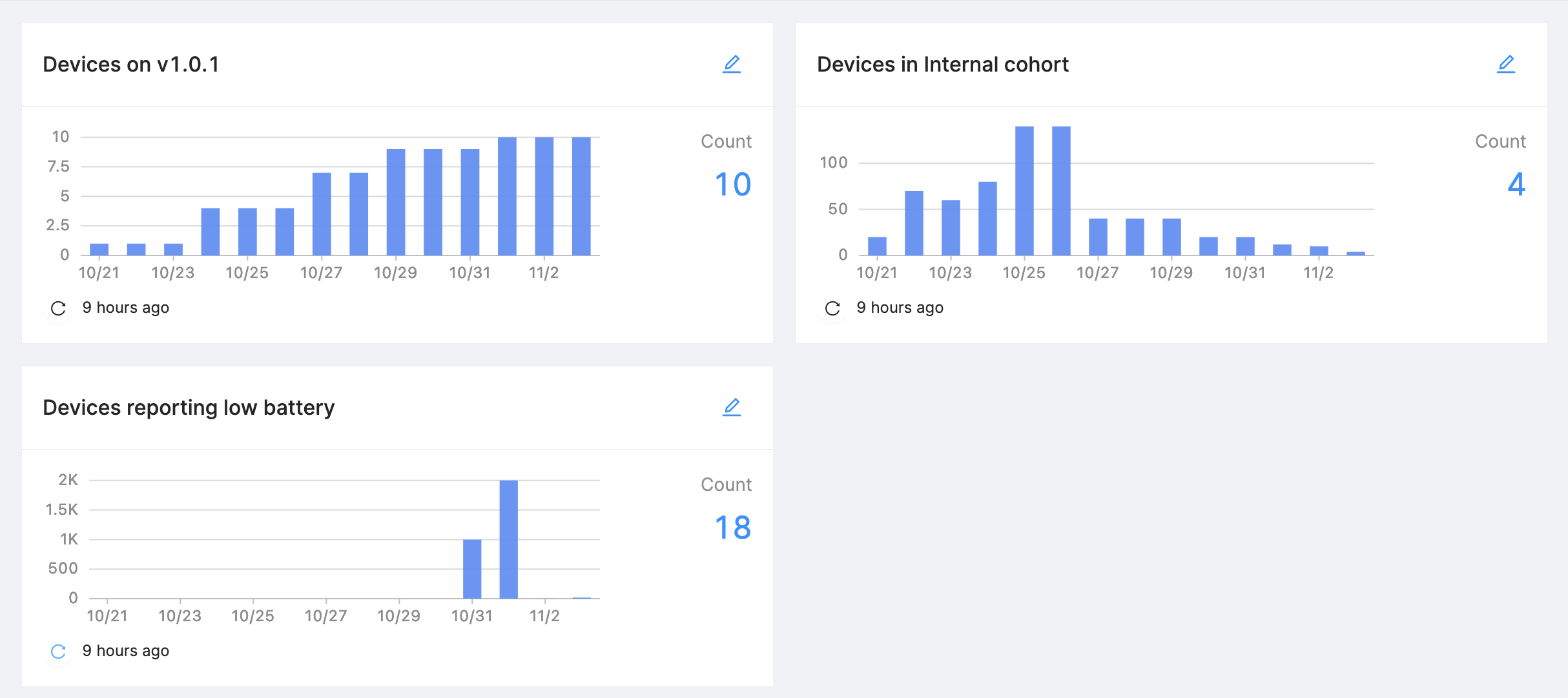
As soon as the Device Set is defined, Memfault starts collecting daily tallies. We store daily tallies for up to 14 days.
Device Sets are not just pretty graphs, you can also get a listing of the Devices belonging to the Device Set, for further analysis.
Device Sets are great for getting concrete answers to fleet-wide questions. As with Cohorts, they are also a great way of categorizing your Fleet, albeit with more flexibility: a Device can be a member of any number of Device Sets.
Creating a Device Set
Device Sets are created from the Devices page. Perform a search, click on the Save as Device Set button, give the Device Set a name (and optional description), select a dashboard you want to put this in, and you are done! You can view your newly created Device Set on the Dashboard you selected.
Depending on the query, it may take up to a day for the first data to trickle in.
Viewing the Devices currently in a Device Set
Clicking the latest count for a Set will take you to the Devices page, with the appropriate search terms filled in.
Interpreting Device Set data
The daily tally corresponds to running the same search query on the Devices page once per day, at roughly the same time. This provides an excellent large-scale overview of whatever properties of your fleet you may be interested in, but you shouldn't rely on the exact number, since the tallying time may vary slightly from day to day.
When using any time-related criteria to describe a device set (for example, "Last Seen" or "Historical Data" filters), the "Start date" and "End date" values are stored into the Device Set as relative to the time of the query, as depicted below:

Editing/deleting a Device Set
You can edit the name and the description of the Device Set by clicking the edit button. Editing the search query itself is disabled to preserve comparability with historical data, if you need to change the query, create a new Device Set.
You can of course also delete a Device Set that no longer interests you.