Dashboards
Configurable Dashboards
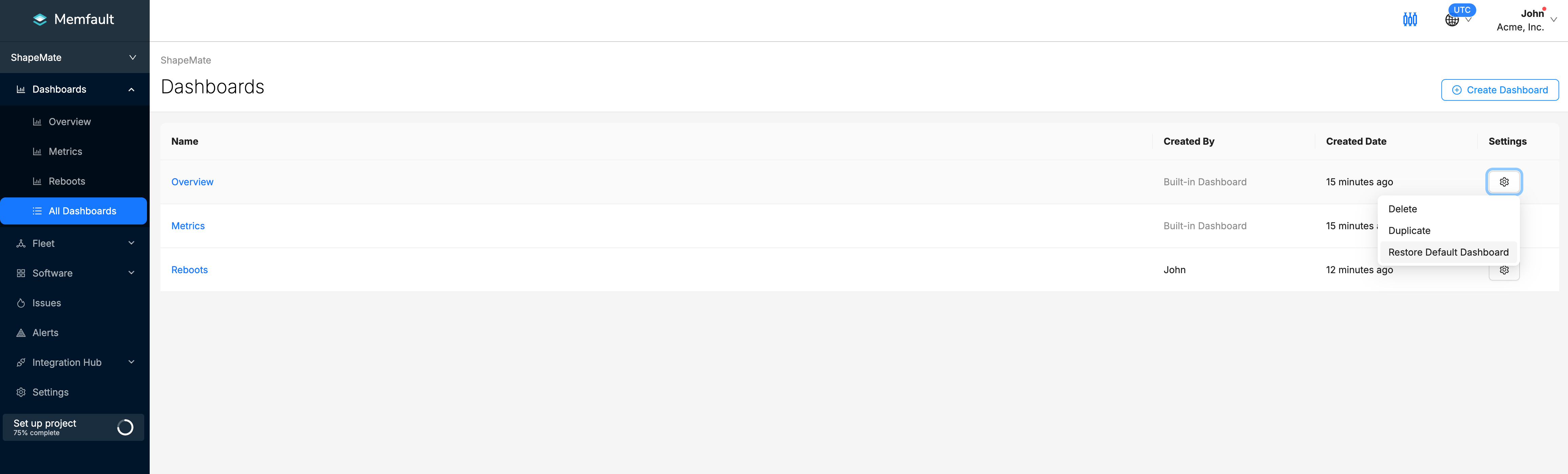
Memfault allows you to create multiple dashboards to visualize and group your data. You can create a dashboard for each of your different use cases, or create a dashboard for each of your teams. Configurable dashboards allow you to create a specific set of metrics that you can share with your team. You can create and duplicate dashboards from the All Dashboards page located in the left navigation bar. To open it, go to Dashboards → All Dashboards.
After creating a dashboard, you can add metric or issue charts to it. Fill up your dashboard with charts that are relevant to your team or give your team a high-level overview of your device health. For more in-depth information on how to create charts, check out the Charts page.
Overview Dashboard
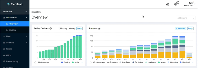
The Built-in Overview Dashboard offers a selection of charts that provide an outlook of the state of your fleet at a glance. To open it, go to Dashboards → Overview.
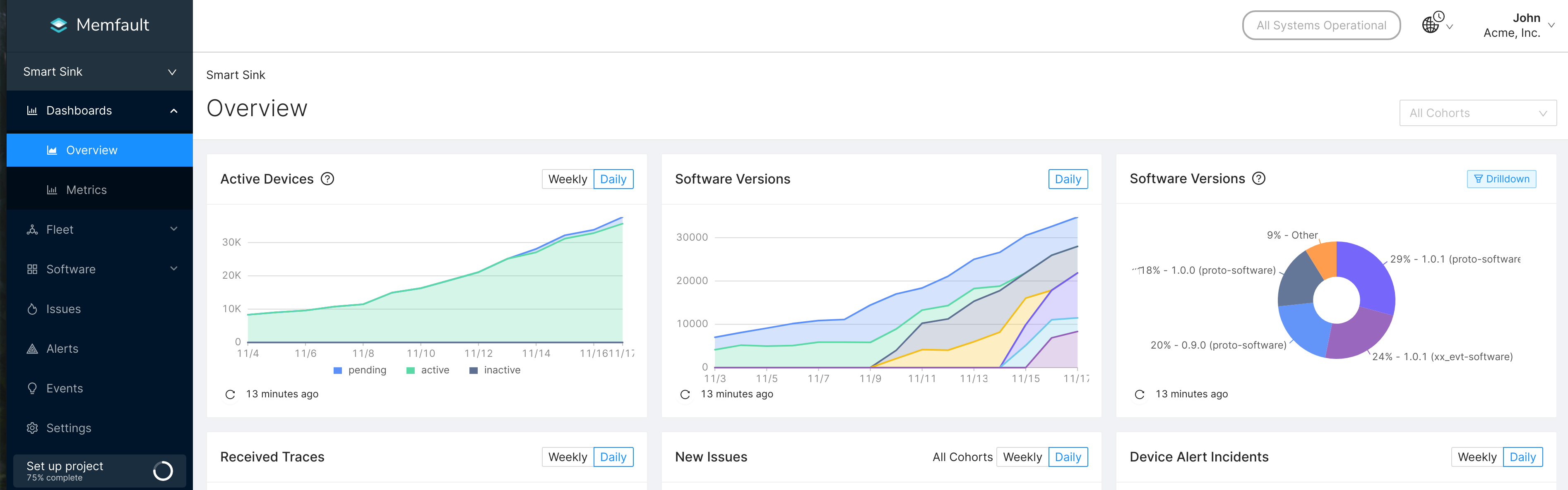
Active Devices and Software Versions of your fleet in the Memfault Overview Dashboard.
If you alter or delete any of the charts in the Overview Dashboard, you can
always restore the default version by clicking the Restore Default Dashboard
button on the All Dashboards page.
Layout Mode
After building your charts, you can use the Layout Mode to rearrange them in a
way that makes sense to you. To enter the Layout Mode, click the Layout Mode
toggle on the top-right corner of the page.
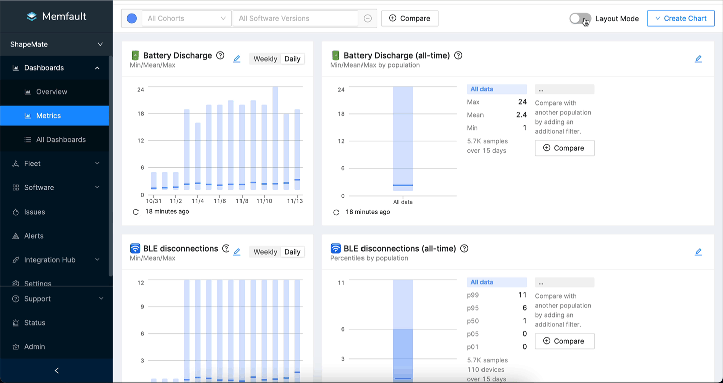
Inside the Layout Mode, you can drag and drop the charts to rearrange them. You
can also resize the charts by dragging the right corner of the chart. To exit
the Layout Mode, click the Layout Mode toggle again and the changes will be
saved.
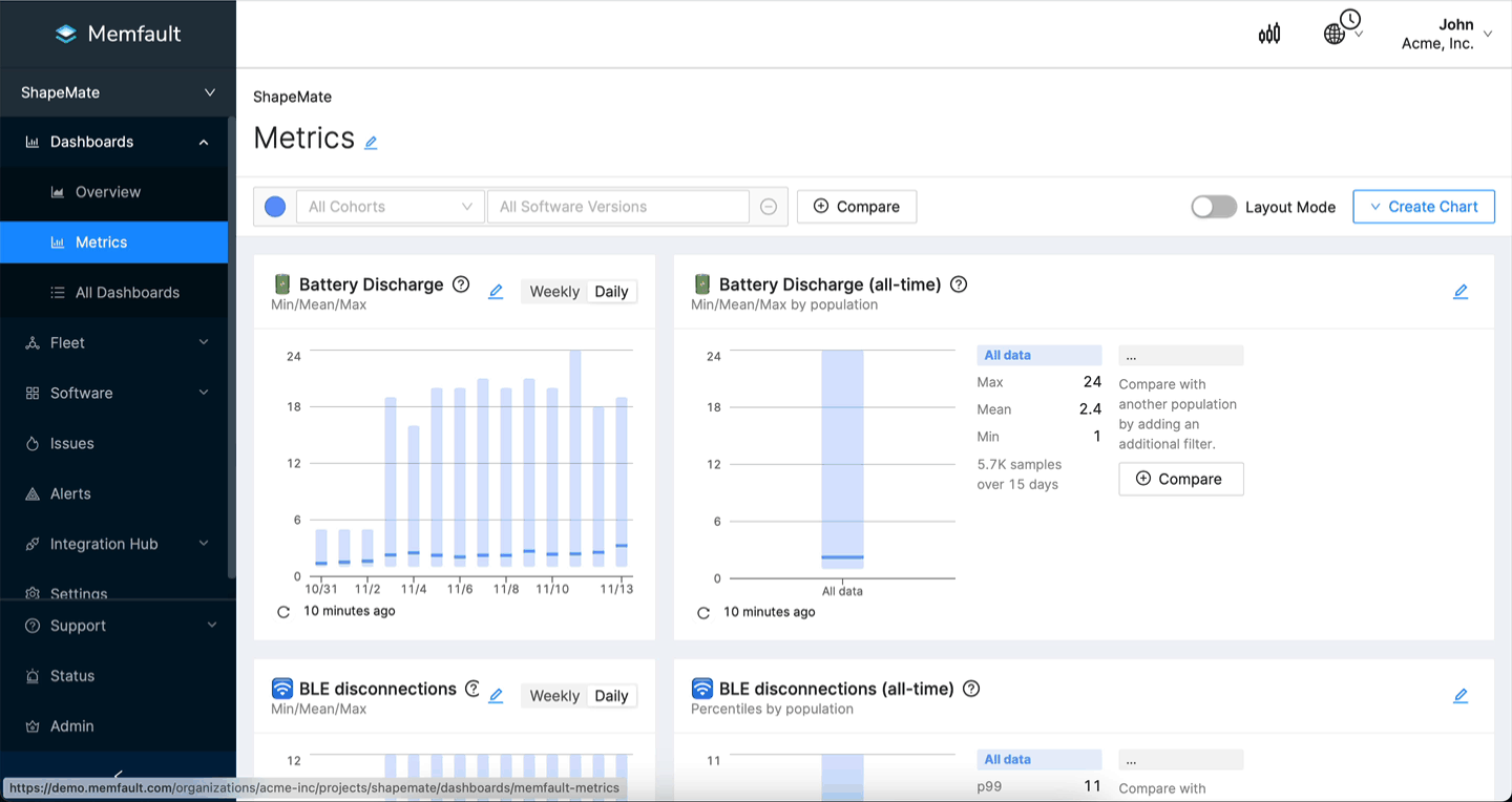
Filtering Charts
You can filter the values visible in the charts by selecting from the available filters in the top area of the page:
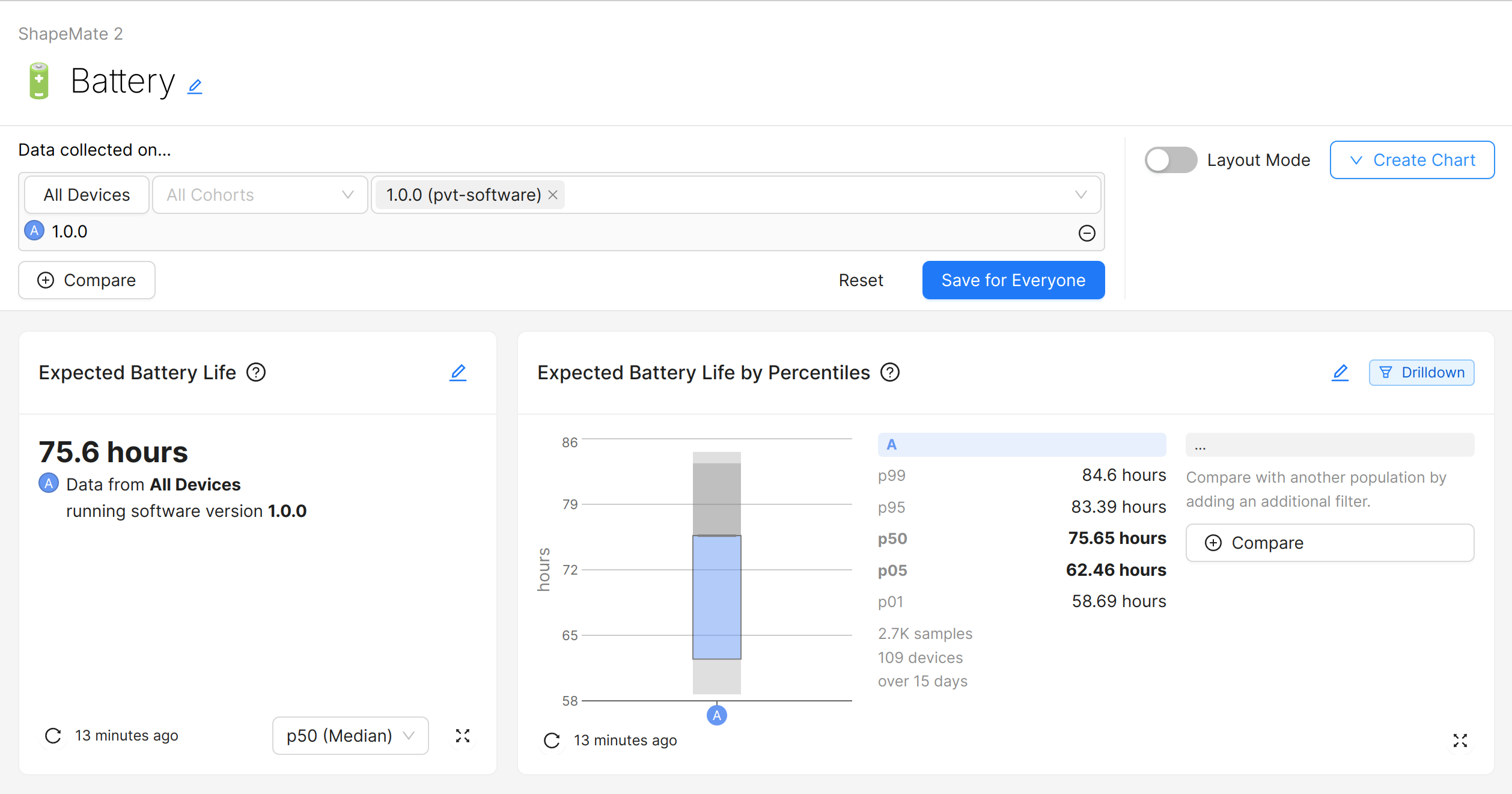
The available filters:
These filters can be saved, by clicking the Save for Everyone button. As the
name suggests, this will change the filters for everyone in the Organization
viewing the Dashboard.
You can change the filters and get back to the saved version by clicking
Reset.
Filtering by Devices
To filter the data by Devices, you can click the "All Devices" button. This will open a modal dialog with all Device filtering options. The options are (almost) the same as in the Fleet → Devices page. The modal also shows a preview of the selected Devices. Click "Apply" to apply the filter.
Once a filter is applied, the Devices button will change into a blue button saying "Filtered Devices".
Filtering by historic Software Version
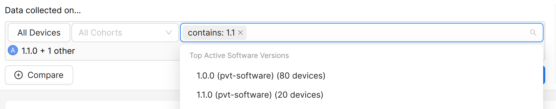
To filter the data by the historic Software Version, you can select one or more Software Versions from the right-most dropdown.
The historic Software Version is the Software Version that was running on the Device at the time the data was captured. Note this is different from the Devices filter's "Current Software Version" option, which filters Devices based on their current Software Version.
This filter is most useful in combination with the "By Cohort or Software Version" rollup option of Metric charts and Device Vitals charts, to get a per-Software Version breakdown for each chart.
Filtering by historic OS Version (Android only)
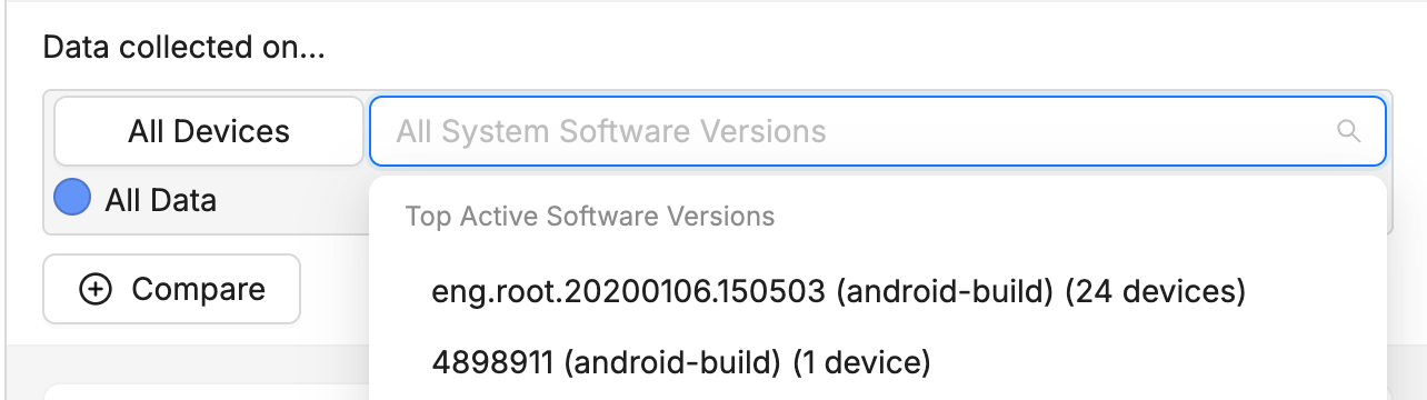
To filter the data by the historic
Android OS / android-build Version,
you can select one or more Software Versions from the Software Version dropdown
as normal. For Android projects, the dropdown will only show the Android OS
Versions. This is because all data collected from Android devices (monitoring,
debugging and log data) is attributed to the android-build version and not to
the app versions. Memfault has future plans to extend this coverage and
attribute these data points also to the versions of the apps running at the time
of the collection of the data (e.g. reboot when app version X was running).
The historic OS Version is the Android OS Version that was running on the Device at the time the data was captured. Note this is different from the Devices filter's "Current Software Version" option, which filters Devices based on their current Software Version.
The distinction between OS Version and Software Version (individual app versions) is only relevant for Issue/Trace Charts and only for Android projects. A Trace from a crashing Android app will have the app's Software Version as well as the Android OS version associated with it. Using the OS Version filter, you can filter the Issue/Trace Charts by Android OS Version, regardless of the (app) Software Versions of the aggregated Traces.
To see crashes of a certain app version, you can create an Issue Chart using the Software Version filter on the Issue Search Page.
Incompatible Filters
Some charts may not support certain filters. This is indicated by a warning on the chart. The tooltip will show which filters are incompatible with the chart:
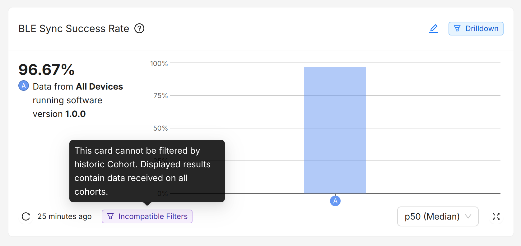
Please get in touch with our support team if you need a chart to support more filters.
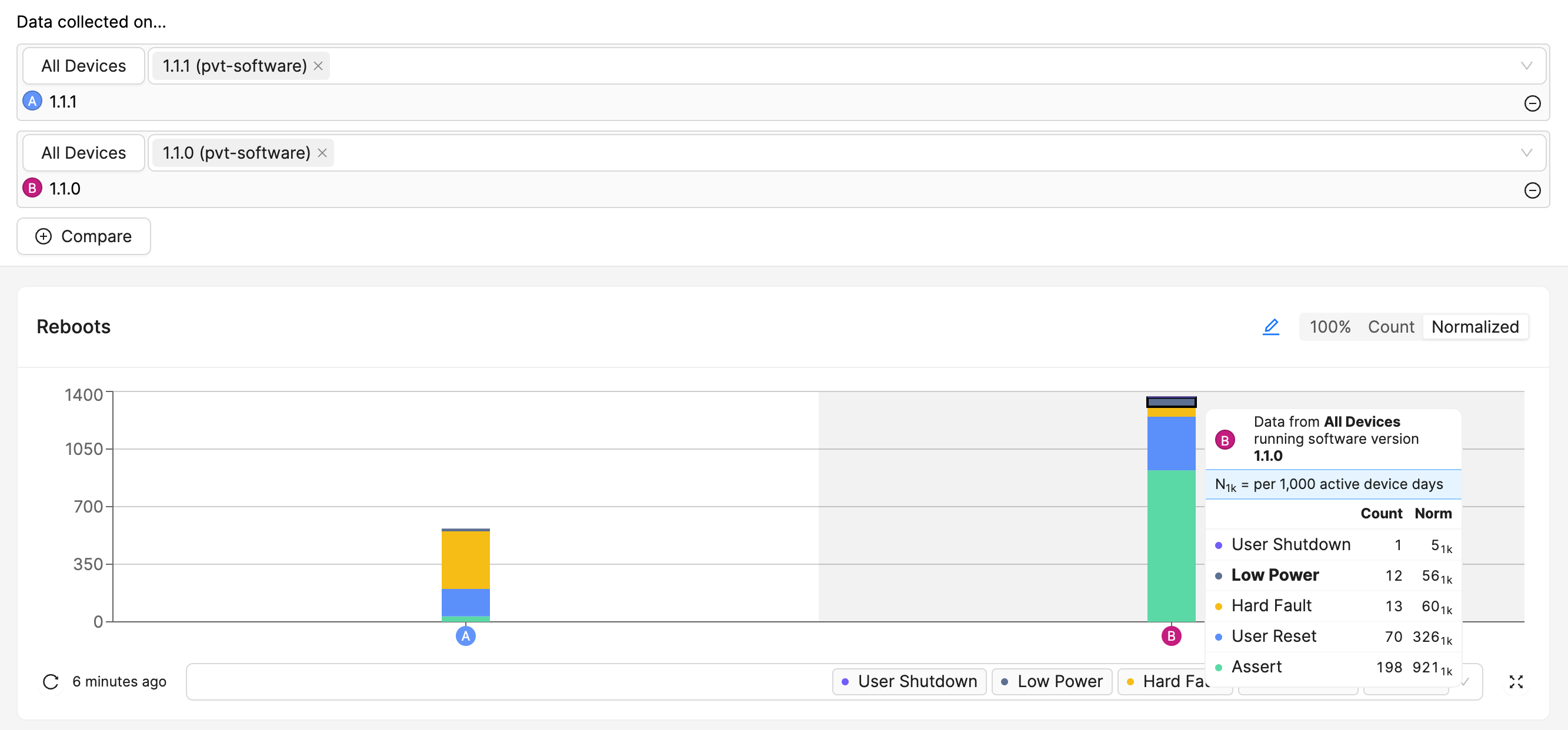
Comparison Mode
To compare the data from different sets of Devices, you can click the Compare
button next to the filters section on the top-right area of the page to add a
new colorized selection to the filters as well as the charts:
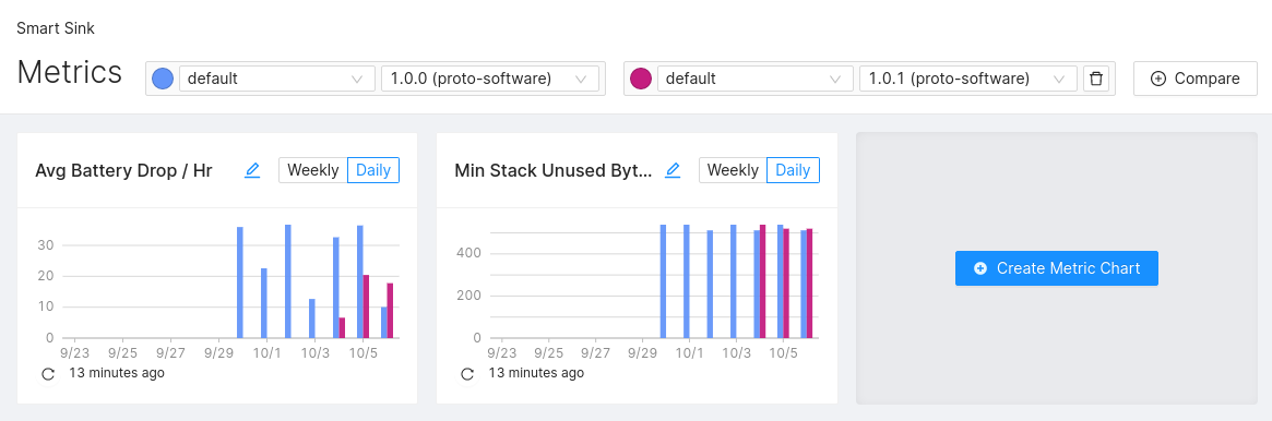
When comparing Metric and Issue Charts, bear in mind that the aggregations
Count and Sum lead to absolute values that are a function of the number of
Devices reporting the given value. When visualizing absolute values for
different sets of Devices, the resulting chart could be misleading as the
underlying number of Devices per set may vary. Also see
chart normalization for more information.
Comparisons can also be saved with the Save for Everyone button, and changes
can be undone via the Reset button.
Drilldown
Some charts that have a Drilldown badge on them can be clicked on sections of the chart (and sometimes also on labels) to dig into the information behind the clicked section. For example, clicking on a section in a Reboots chart will go to a filtered-down list of Devices that make up the data for that interval and reboot reason.
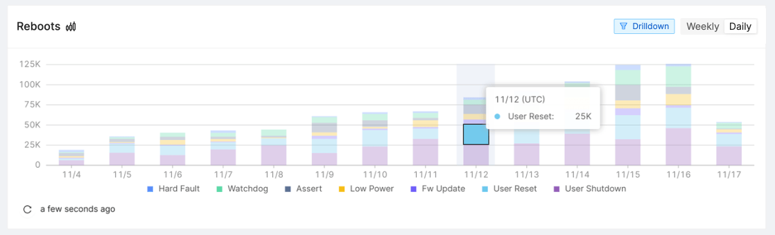
Clicking on this section will give you a list of devices that rebooted on November 12th due to a user reset.
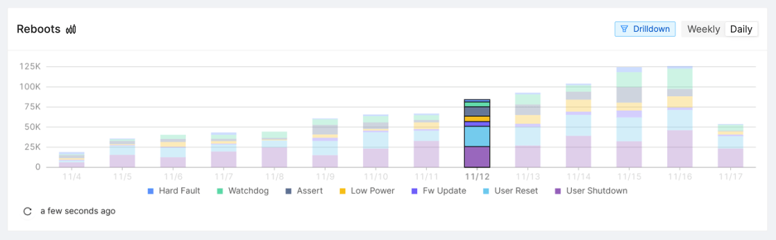
Clicking on the label will give you a list of devices that rebooted on November 12th for any reason.
Chart Normalization
Chart Normalization converts absolute values such as number of incidents, sums, and counts to relative values "per 1,000 devices". This helps understanding real trends when you are comparing these values between populations of different sizes (e.g. comparing devices from large production Cohort Default against those from a smaller test Cohort Beta) or when the population size changes over time (e.g. new devices being activated continuously or changing Fleet Sampling resolutions).
Toggling Chart Normalization on/off
This is a global setting for all browser tabs that you can toggle in the top
right corner of the page, next to the timezone selector. Additionally for
convenience, each chart has a small button ![]() that allows
toggling the feature globally.
that allows
toggling the feature globally.
Charts that support Normalization
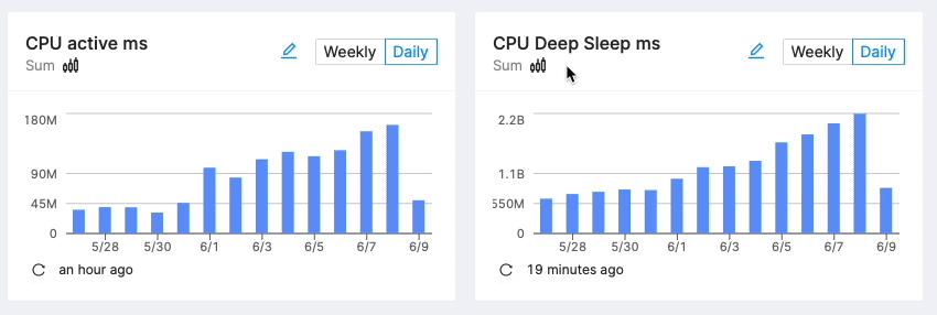
Chart Normalization is supported on all charts that show absolute values such as number of incidents, sums, or counts. For values that are not affected by the population size (e.g. minimum, maximum, average) Chart Normalization would have no affect and the feature is unavailable.
Population and Normalized Values
The population represents the number of devices that contributed to the value. Usually, this is based on the Active Devices for the corresponding time span.
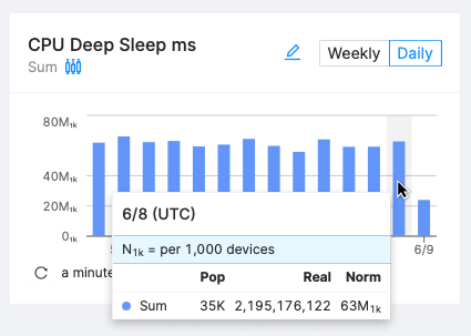
Normalized values are depicted with a suffix 1k in the bottom right corner next to the value (and are pronounced "per 1,000 devices"). Examples:
- 42₁ₖ means "42 per 1,000 devices"
- 3K₁ₖ means "3,000 per 1,000 devices".
To calculate the normalized value () from the absolute value () and a given population () use the following formula:
For the values in the screenshot above that translates to:
Examples of Chart Normalization
Comparing Values Between Cohorts
If you're interested in seeing an all-time comparison between multiple Cohorts or multiple Software Versions, use Metric Charts by Cohort or Software Version.
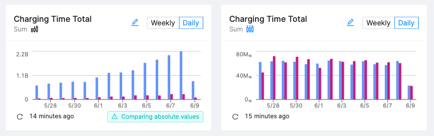
Without Chart Normalization (left): Cohort A (blue) reported more than 10x the duration spent charging compared to Cohort B (purple). But in reality, both cohorts have a growing population with Cohort A consisting of 13,000 devices and Cohort B of only 1,000 devices.
Relatively speaking, the time spent charging stayed the same at about 60M₁ₖ.
Population Changes
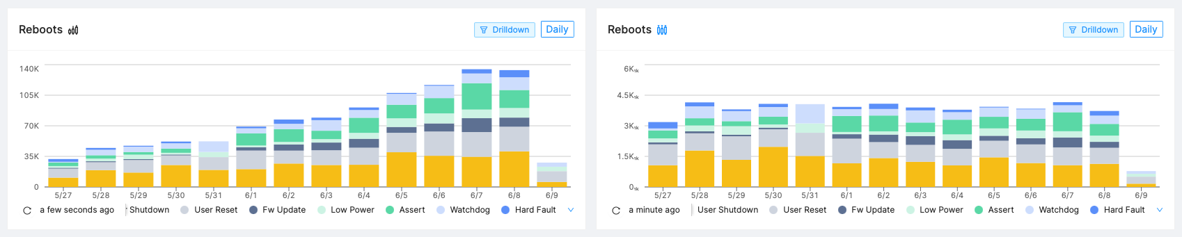
Two weeks ago, the fleet reported 36K reboots per day steadily growing towards 130K daily reboots. It looks like the devices started to reboot more often. But in reality, the population grew from 10K devices to 36K devices during the same time span (as more people unpacked devices).
Relatively speaking, the number of reboots stayed the same at about 3.6₁ₖ.
Normalization by Active Device Days
While normalizing by the population size is useful for comparing absolute values over time, it does not account for the fact that some devices may have been active for longer periods of time than others. To account for this, you can normalize by the total number of active-device-days when comparing reboots over all time by population aggregation. This will give you a value that represents the number of reboots per 1,000 device days.
Device VS Data
Devices
When targeting a Device you are looking for information about its current status, and reviewing its historical data.
Device queries/filters are the tool to use when you are looking at a specific Device. In the app you will sometimes seen Device searches prefixed with "Current" (Example: "Current software version")
Data
When targeting data the search will respond with all data that meets the requirements of the search, disregarding the current status of the Device. Data queries are what you should use when you are looking for the value of a specific software version.
How does this work on your Memfault dashboard?
Device filtering is the button on the left side of the "Data collected on…" section of the dashboard. The data filters are the All Cohorts and All Software Versions sections inputs on the right side of the "Data collected on…" section of the dashboard.

Imagine a situation where you have had 3 Devices, with the IDs 10,55, and 999. and three different versions of your software.

If you did a Device query for ID:999 it would look like this:

If you did a data query for SWV: 1.0.0 it would look like this:

So far all of the examples have been pretty straight forward, but what happens if we do a Device query for Devices on software version 7.7.7?

Notice in the illustration above we are also getting information from 1.0.0, and 2.5.0? why? This is because the Device search looks for all Devices with any of their primary or secondary software versions set as 7.7.7 and gets all of heartbeats from those Devices.
Device and Data queries can be used in conjunction with each other to target specific information. Take the example of a Device Query for SWV 7.7.7 and a Data Query for SWV 1.0.0:

Notice how this returning heartbeats from 1.0.0 for the Devices where the CURRENT version is 7.7.7.
Imagine you are recording people (Device) and conversations (data). You can filter down people by attribute such as "current age", or "country of residency" or "country of birth" or "languages spoken". Some of these attributes are varying over time, some are (theoretically) stable (there are always exceptions). With a population (Device) filter you can answer questions such as "number of conversations of all German residents". Note, some of these people may have traveled or lived outside of Germany during that time period so they would have had conversations in places outside of Germany despite being a Germany resident.
Then you have the conversations (data), each conversation can be filtered down by "duration of the conversation", number of people in the conversation", "country the conversation was held at", "language the conversation was held in" etc. You may wonder "how many conversations did we measure last quarter that were held in German". This is different from "conversations held in Germany" and different from "conversations held by people in Germany".