Using Device Vitals to Create Useful and Powerful Dashboards
Introduction
Memfault's "Device Vitals" dashboards and charts are a suite of powerful visualization options designed to provide valuable insights into the health and performance of IoT and edge devices, and can enable developers, engineers, and product managers to monitor device stability, connectivity, and battery life in real-time, with precision and flexibility.
With multiple different visualization options, users can tailor their dashboards to meet specific needs. Whether you're tracking the performance of a new software release, overseeing a global fleet, or investigating a mysterious bug reported by your users, "Device Vitals" offers the scalability and detail required to make informed decisions quickly.
This guide is crafted to help you harness the full potential of these new features.
But before we get into how to make the most out of "Device Vitals" for your devices and projects, we have to talk about something much more complicated:
Humans.
Understanding Your Audience
Identifying the intended audience of a dashboard is the first step toward making it effective and useful. Start with a clear understanding of who a dashboard's primary users are:
- Engineers and Technical Teams: These users need detailed, technical insights to troubleshoot and optimize device performance. They'll want information that helps them debug devices in real-time, like detailed metrics, crash reports, performance analytics, and domain-specific data that help them focus on improving specific, essential functions of their devices.
- Release Managers: While RMs may have specific metrics they want to monitor - areas where their team is responsible for making improvements - they may be even more interested in monitoring for regressions in unexpected domains. Slicing data by software versions and Cohorts allows these users to isolate just the devices in a beta-release population from the general population, and helps them make important "go/no-go" decisions.
- Product Managers: PMs are interested in the overall health and performance trends of devices. Summaries and percentile visualizations can provide them with the necessary insights to make informed product decisions.
- Customer Support Teams: Support personnel benefit from dashboards that highlight common issues or trends in device performance. This information helps them address customer concerns more effectively, identify areas for improvement, and escalate issues appropriately.
- Executives: High-level dashboards that summarize device fleet health, usage patterns, and key performance indicators (KPIs) are valuable for executive teams. These dashboards should provide a quick snapshot of the business impact of device performance.
Know Your Audience's Likely Questions
Once you've identified the primary users of a dashboard, come up with one or more questions that these users will want answers to when visiting your dashboard. Strive to include only metrics and data points that can directly help them answer those questions, and avoid cluttering the dashboard with unnecessary information that could distract or confuse your audience. Adjust the level of detail and complexity based on the user's presumed technical background and information needs. For instance, technical teams may appreciate deeper insights, while executives might prefer simplified, high-level overviews.
It is possible to create dashboards that satisfy the needs of multiple different personas all at the same time (especially if you identify that these different personas will want answers to the same questions), but doing so runs the risk of reducing the "signal to noise" ratio of your dashboards - any piece of information on a dashboard that a given user finds useless costs them time that they won't consider well-spent. If your dashboards are too "noisy", people may not want to use them at all.
Choosing the Right Visualizations
With "Device Vitals," you have access to a range of visualization options, including Summaries, Major Percentiles, and Over Time views. Each of these serves a distinct purpose and offers different levels of context.
Summaries
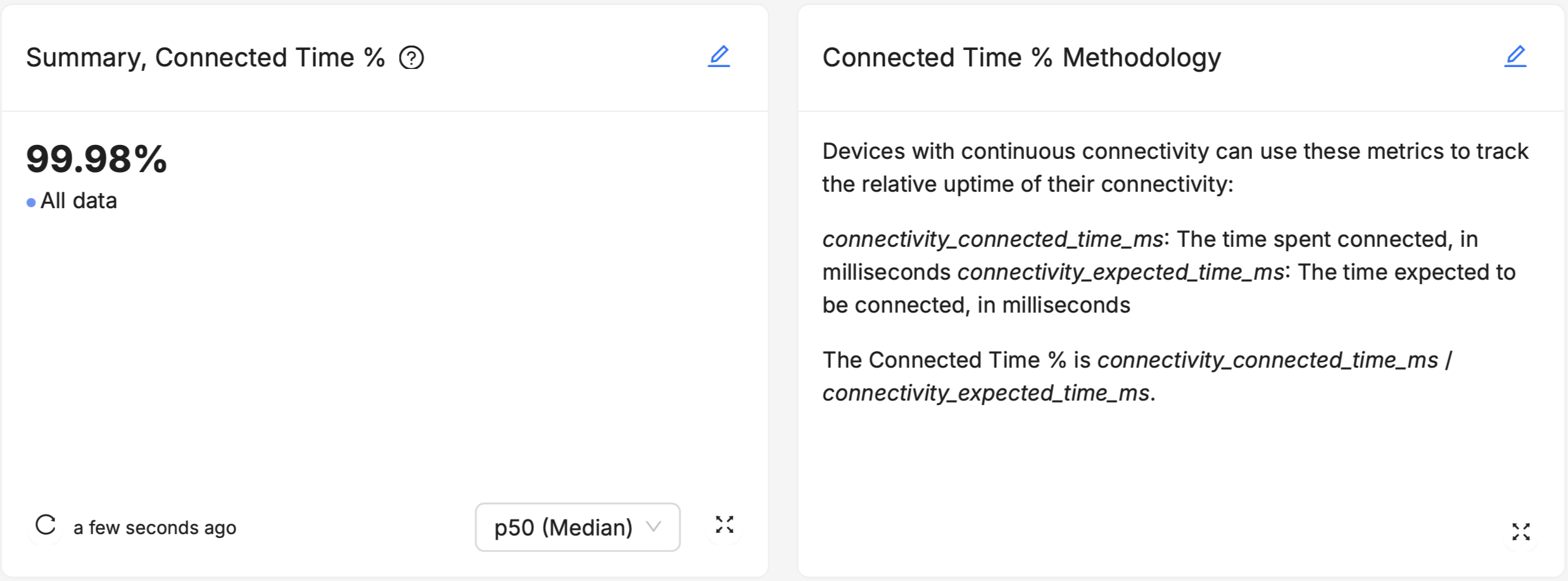
Summaries provide a snapshot of key metrics at a glance. They are ideal for conveying essential information about a population of devices quickly and simply, such as the median Device Vitals value of devices in an important Cohort, or running a particular software version, and make it easy to see the direct difference (or lack thereof) between multiple populations of devices. By default, this summary is an aggregation across data points collected on a given set of software versions and Cohorts across all time.
Summaries are most useful to users who already know the exact portion of a device population they're most interested in monitoring - the best-performing devices (p95 or p99), the worst-performing devices (p05 or p01), or the devices roughly in "the middle" of the population (p50, or "Median"). Summaries are particularly useful for stakeholders who need to understand the big picture without getting bogged down in details.
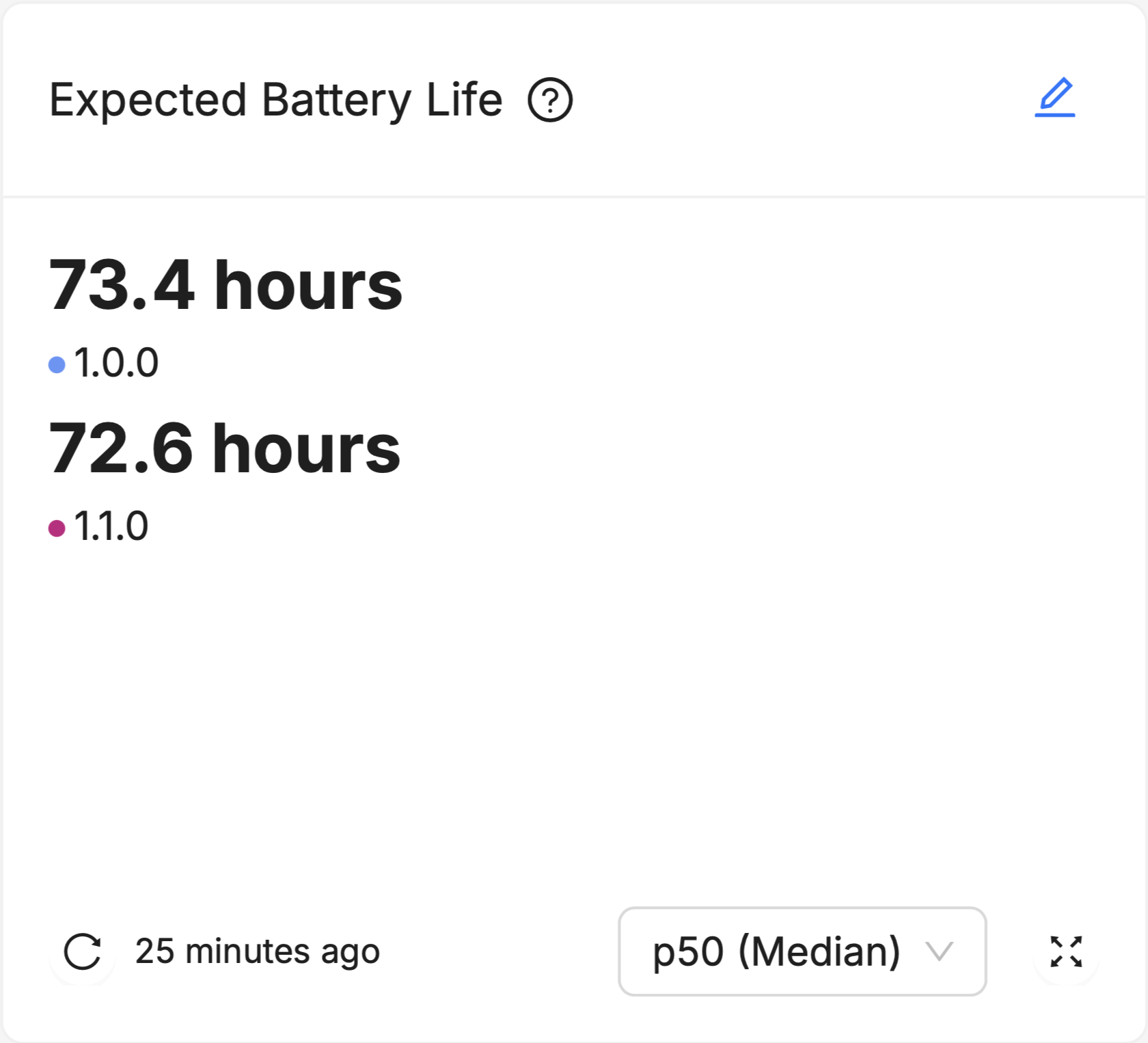
These Summaries default to display the Median device in a given population, meaning that half the devices in the population have a value for that Device Vital which is higher, and the other half of the devices in the population have a value for that Device Vital which is lower. For example, if the p50 (Median) device on version 1.0.0 has an Expected Battery Life of 73.4 hours, half the devices running version 1.0.0 have an Expected Battery Life of greater than 73.4 hours, and half have an Expected Battery Life of less than 73.4 hours. As a measure of "central tendency" (that is, a single data point that is used to try and summarize an entire dataset), the Median point in a population is useful because it gives you an idea of how a "typical" device in the population and holds up well to data sets that are heavily "skewed", or contain many "outliers" (see this nice explainer on the advantages and disadvantages of using the Median).
Summary "Helpers"
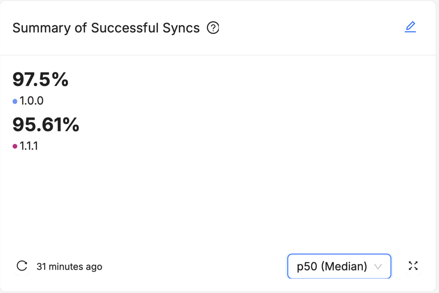
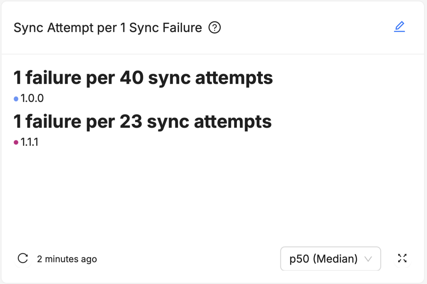
Most of the Device Vitals are represented as a percentage value (like "99.8% Stable Hours" or "97.5% Successful Syncs"). While these percentages are very useful for empirically comparing two different groups, it isn't always clear to an unfamiliar user what a "good enough" value ought to be. For example, is 95% Stable Hours good enough, or would good enough be more like 99%, or even 99.9%?
These values all sound similar (especially 99% and 99.9%) but because these are really ratios, they're not:
- 95% Stable Hours means 19 hours of no crashes before a "crashy" hour occurs
- 99% Stable Hours means 99 hours (about 4.1 days) of no crashes before a "crashy" hour occurs
- 99.9% Stable Hours means 999 hours (about 6 weeks) of no crashes before a "crashy" hour occurs
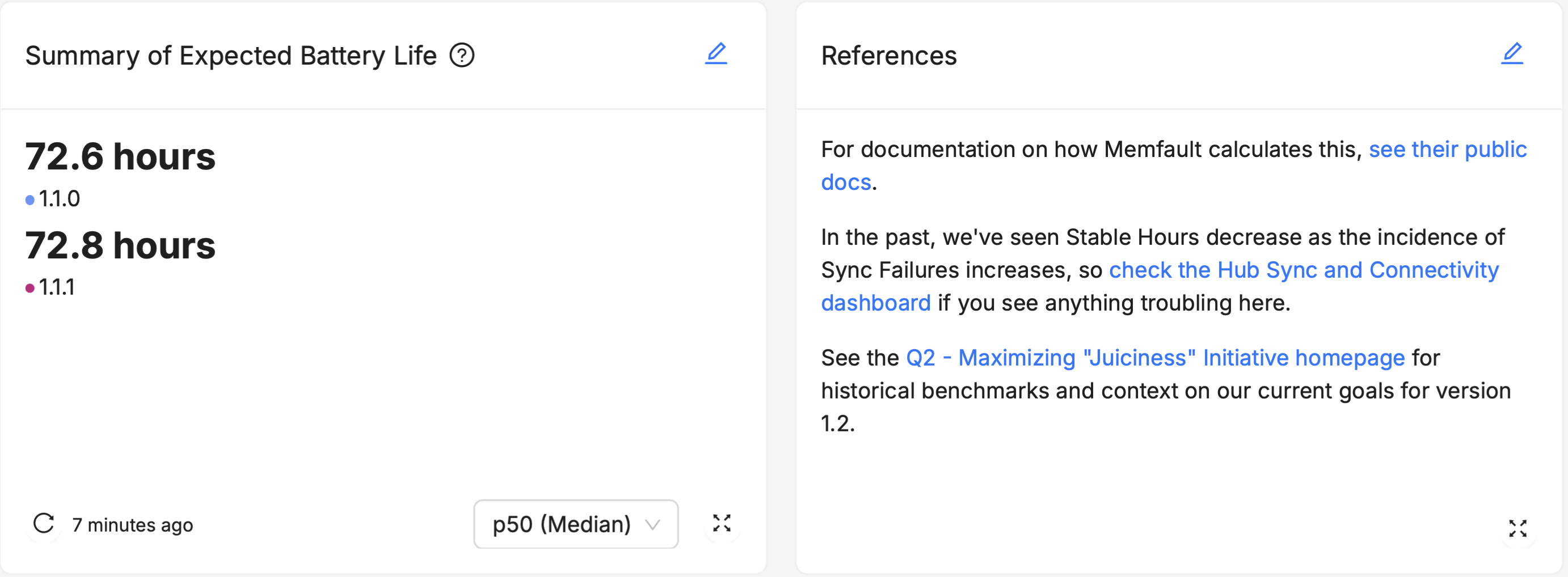
For this reason, we've included Summary "Helper" cards for all our Device Vitals that represent these % values in a way that's easier to grasp the "real-world" implications of:
- "Summary of Stable Hours" has the "Stability Period" helper
- "Summary of Connected Time" has the "Connected Time per 1 Hour of Downtime" helper
- "Summary of Successful Syncs" has the "Sync Attempts per 1 Sync Failure" helper
When introducing your audience to any of these percentage-based Device Vitals, consider incorporating instances of these "Helper" charts to help them contextualize the information.
For a longer explanation of why such percentiles are a useful way to think about Vital measurements like Stable Hours, see Tyler Hoffman's "Counting Crashes" post on our Interrupt Blog.
Major Percentiles
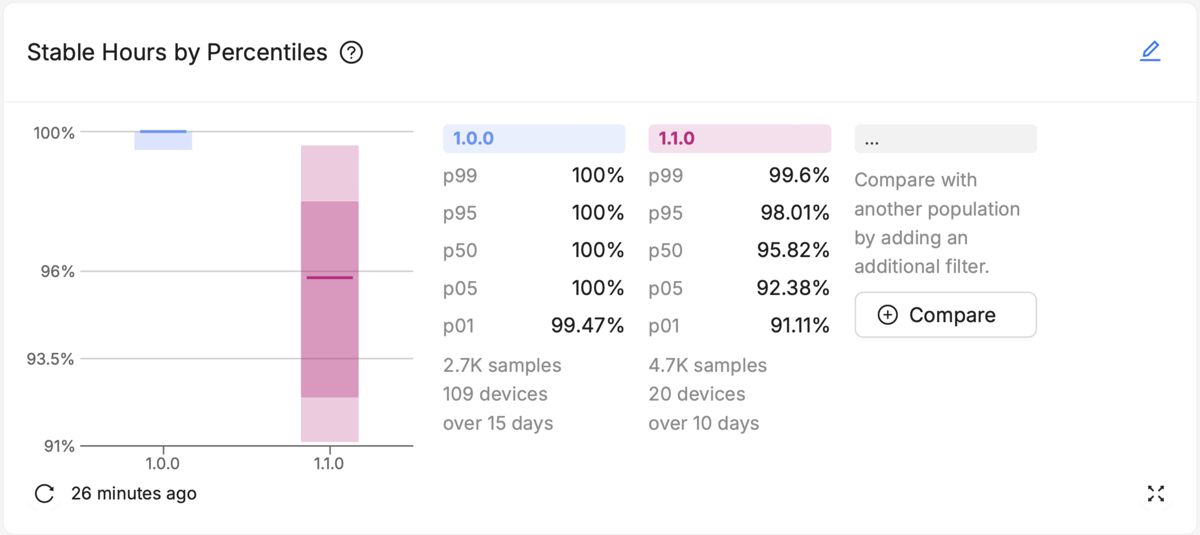
Major Percentiles charts offer more nuanced insights into the distribution of device performance across your fleet. They can help visualize outliers, and understand the level of variability within a population.
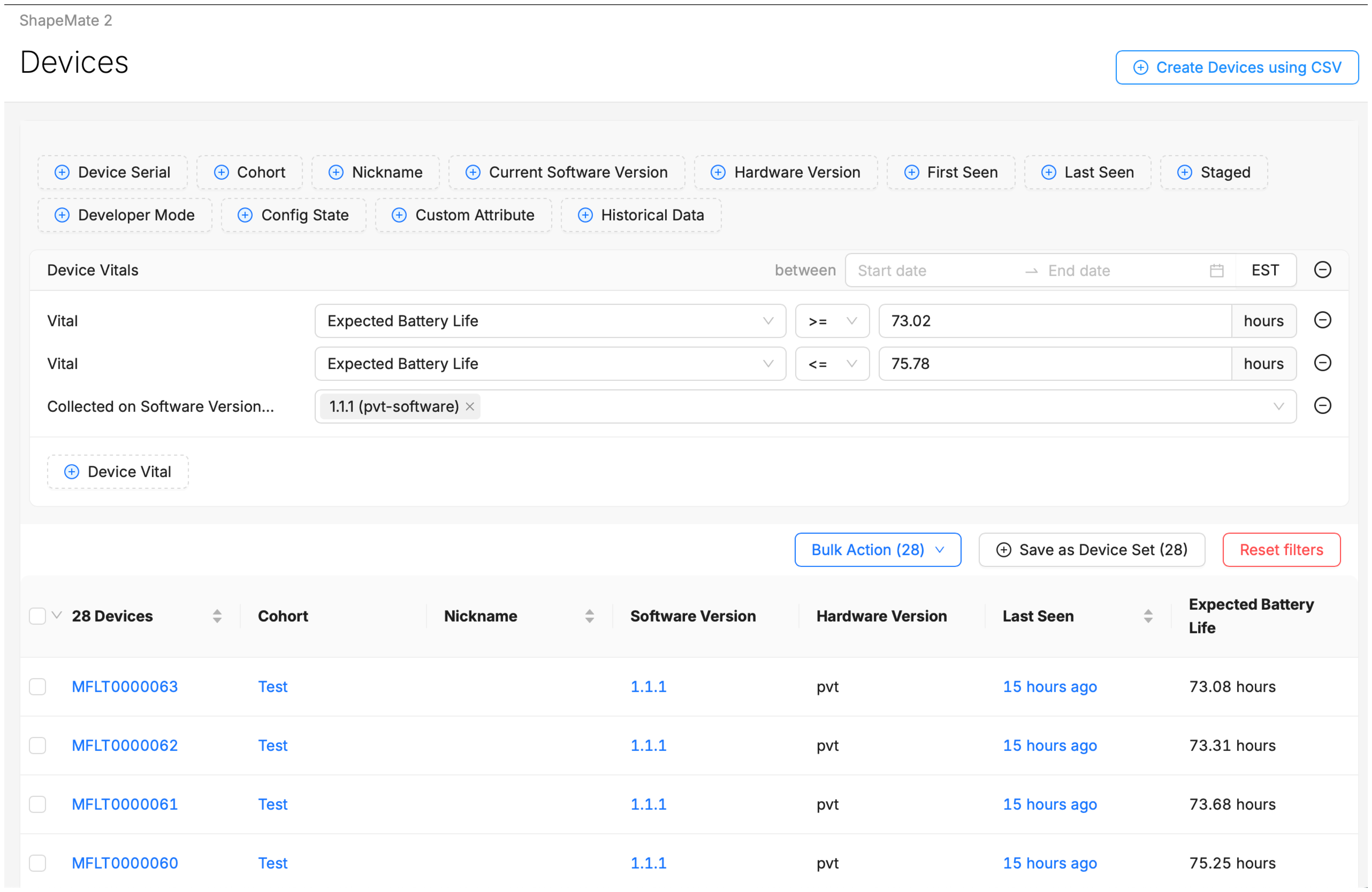
Additionally, Major Percentiles offers a "Drill Down" option, where users can select a visualized percentile "range" of devices within the chart (like all devices from p50 to p95), and immediately be brought to a pre-filtered Device Search page that lists each of those devices out.
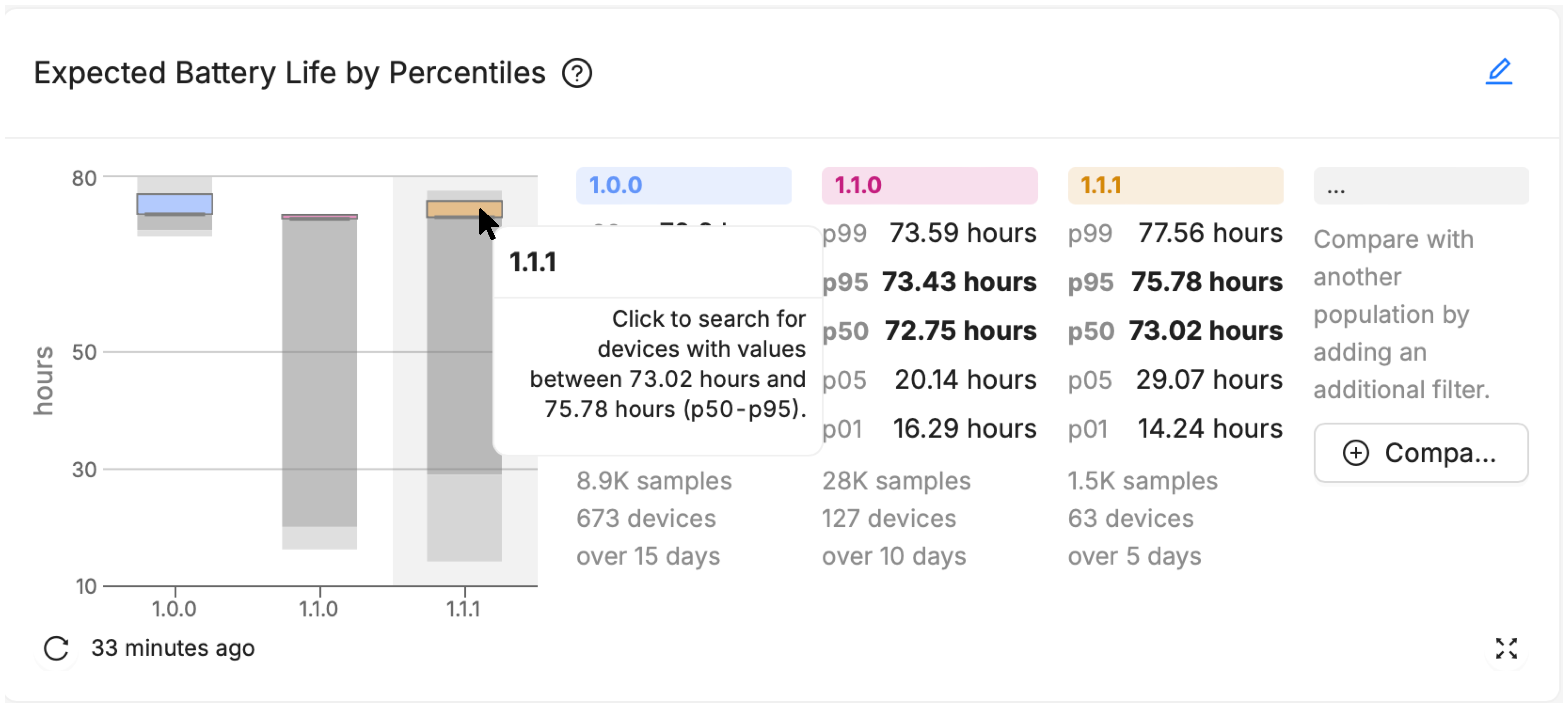
On the resulting Device Search page you can see the specific devices and their aggregated value of the selected device vital. From here you can navigate to a specific device, or adjust filters to further refine and narrow your search.
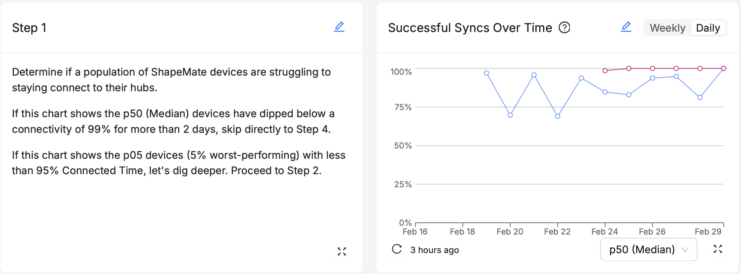
Over Time
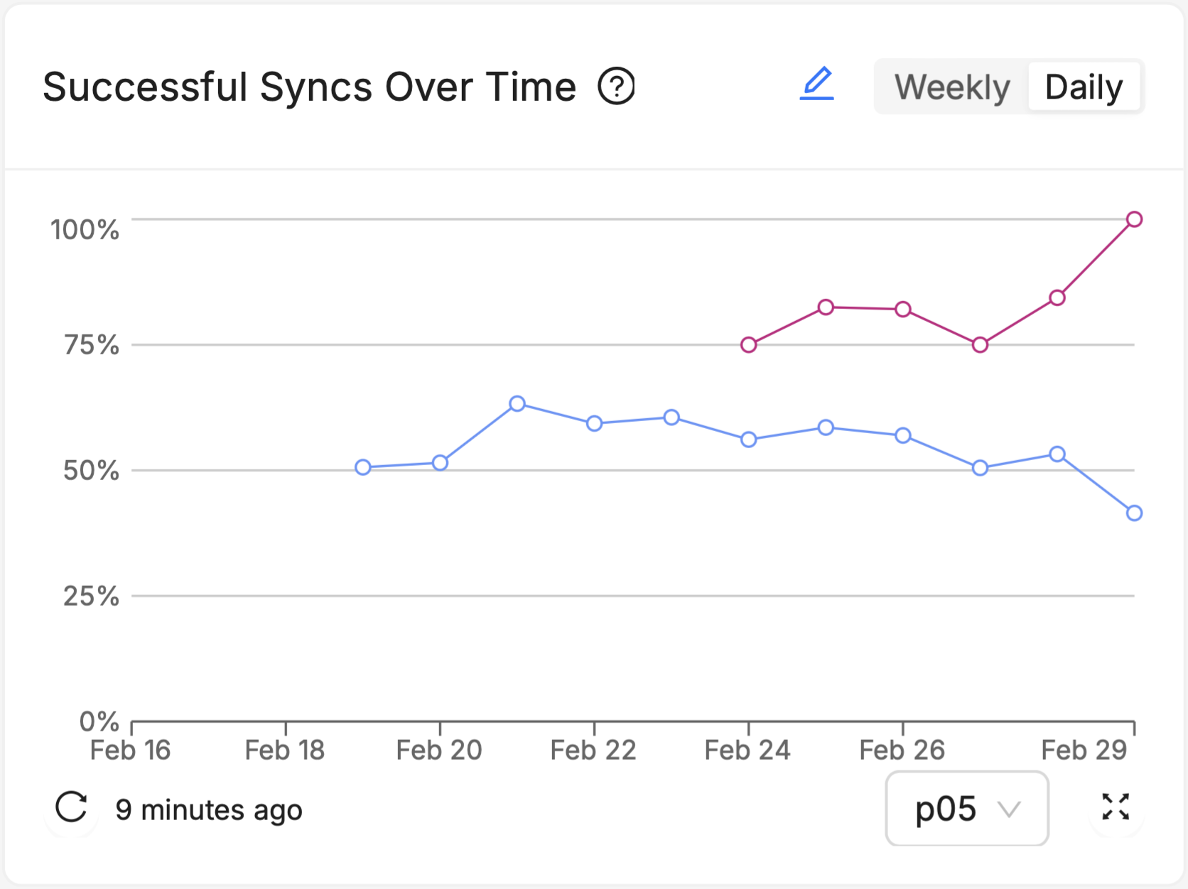
Over Time charts track the Vitals of your fleet over the recent past (fourteen days in the daily view, 7 weeks in the weekly view) , allowing identification of trends, patterns, and anomalies that occur outside the context of what Software Version a device is running, such as changes made to other connected systems in your devices' ecosystems, seasonal trends in user behavior or the weather, or understanding the impact of specific, one-time events. Multiple software versions (or groups of software versions) and Cohorts (or groups of Cohorts) can be visualized side by side as multiple series on the chart (see the red and blue series on the chart above), to see how the different groups responded to those events or external trends differently.
Utilizing Markdown Cards for Enhanced Clarity
Markdown cards are a versatile tool that allow for the inclusion of flexible-text elements such as notes, comments, links, and more. These cards can significantly improve the clarity and usefulness of your dashboards by providing context, explanations, and actionable insights alongside your visual data.
If you're new to Markdown in general, here's a good introduction to it.
Examples of How Markdown Cards Can Be Used
Comments and Annotations
Like good comments in a code base, add explanatory notes or annotations to your dashboards to guide users through the data. For instance, you can explain what a specific metric means, how it's calculated, or why it's important for decision-making.
Links
Link to other dashboards, views, or data within your Memfault instance that can help users understand or take action on the data they're viewing. Embed links to external locations, such as technical manuals, run-books, issue trackers, or project management tools. This can help users quickly access related information or perform follow-up actions.
Instructions and Guidelines
Include step-by-step instructions or guidelines for responding to specific scenarios highlighted by the dashboard. For example, if a dashboard tracks firmware update rollouts, you could add a Markdown card with steps to troubleshoot common issues encountered during updates.
In general:
- Keep your text concise and to the point.
- Keep your formatting consistent across all your Markdown cards to help users quickly scan the text.
Best Practices for Monitoring Device Vitals
With the new "Device Vitals" dashboards and charts, you have powerful tools at your disposal to keep a close eye on stability, connectivity, and battery life. Here are some best practices to effectively monitor these key aspects of device health and performance.
Stability
- Lower Percentiles May Contain "crash-looping" devices: Depending on the nature of a given crash, it may precipitate a "crash-loop" where a device crashes over and over again. Such a device may have a "stable hours" score that is much lower than the median device in your fleet. Drill down into the p05 and p01 ranges of devices on the Major Percentiles of Stable Hours to examine the characteristics of individual devices, and search for behavioral signs of crash loops on the Device Timeline.
- Use the Summary "Helper" chart: Unlike some other vitals like Expected Battery Life, users who are new to measuring/monitoring Stability may not have an intuitive sense of what "good enough" is. Plus, as stated above, your users may not intuitively grasp that 99.9% is not just "0.9%" more stable than "99.0%" - because this is a ratio, it's actually ten times more stable. Consider using the Stability Summary "Helper" chart (titled "Stability Period") in contexts where you expect newer users to view your Stable Hours scores. This can help them get a sense of the real-world implications of small differences in the percentage scores.
- Other Built-in Charts relevant to Stability: Aside from the new Device Vitals charts, consider incorporating Issue Charts and Reboots Charts to dashboards that focus on Stability, especially where anyone actively participating in technical debugging activities (like Firmware Engineers, Product Managers, for instance) is the intended audience.
Battery Life
- Over Time charts may highlight environmental effects: Do your end users have predictably irregular usage patterns (for example, they use the device much more actively on weekends)? Is the device used outside, where it will be potentially susceptible to changes in ambient temperature that are well outside your control? This chart can't answer those questions for you, but it can help you know when to ask - "if nothing in the software changed between February 25th and February 27th, but expected battery life dropped significantly over that period, what did change?"
- Drill Down tips: Use the Major Percentiles drill-down to investigate the behavior of devices in your lowest percentiles (p05, p01), and use filters like Hardware Version or Device Attributes to try and figure out what these low-performing devices have in common. Are their rechargeable batteries just worn down after too many charge cycles? Did they all have battery components sourced from a particular supplier? Select individual devices from the Device List to explore individual moments of excessive battery drain on the Device Timeline, and see if they co-occur with other issues a device might be experiencing, like repeated network disconnects, reboot loops, crashes, or other aberrant behavior.
Connectivity
- "Periodic" vs. "Always-On" Connectivity: If your device is intended to have "always-on" connectivity whenever it is powered on - for example, a security camera with a wired connection to the internet, or an environmental sensor with a persistent WiFi connection to a "hub" device - consider using Connected Time % as your primary connectivity metric. If, on the other hand, your device is only expected to connect to the internet or another target device/system in short, periodic bursts - like a health monitor that syncs with a smartphone once every hour, a smart lock system that initiates a connection attempt only when prompted by the proximity of an NFC signal, or a wilderness air quality monitor that syncs with its back-end server only once per day via orbital satellite connection - consider using Sync Success % as your primary connectivity metric.
- Different Sync Targets: When adding Sync Success % charts, you have the choice of whether to visualize how consistently your devices sync with your own, non-Memfault device or system (like another hub device that you manufacturer, a third-party device like a smartphone, or your back-end system/cloud infrastructure), or whether you want to see the success rate of syncing directly with Memfault's cloud (i.e. how successful are your devices at sending data directly to Memfault). The best choice for you here depends largely on what your device's network capabilities are, whether it is a "stand-alone" device in the field, and whether it has its own internet connection.
Dashboard Composition
A well-composed dashboard not only presents data clearly but also guides the user through a logical narrative, helping them understand the most important information first and providing more detailed data as needed. Consider the following when organizing dashboard elements for optimal user experience:
Keep Key Metrics at the Top
Based on your understanding of your audience and their "likely questions", start by identifying the most critical metrics or data points that your audience needs to see. These should be placed prominently on the dashboard, often at the top, to catch the user's attention first. Less scrolling means time saved for your users every time they visit the page.
For example, in the above screenshot, if Expected Battery Life is likely to be of greater concern or importance than Sync Success Rate to the intended audience, than its placement at the top of the dashboard is optimal.
Group Things Logically
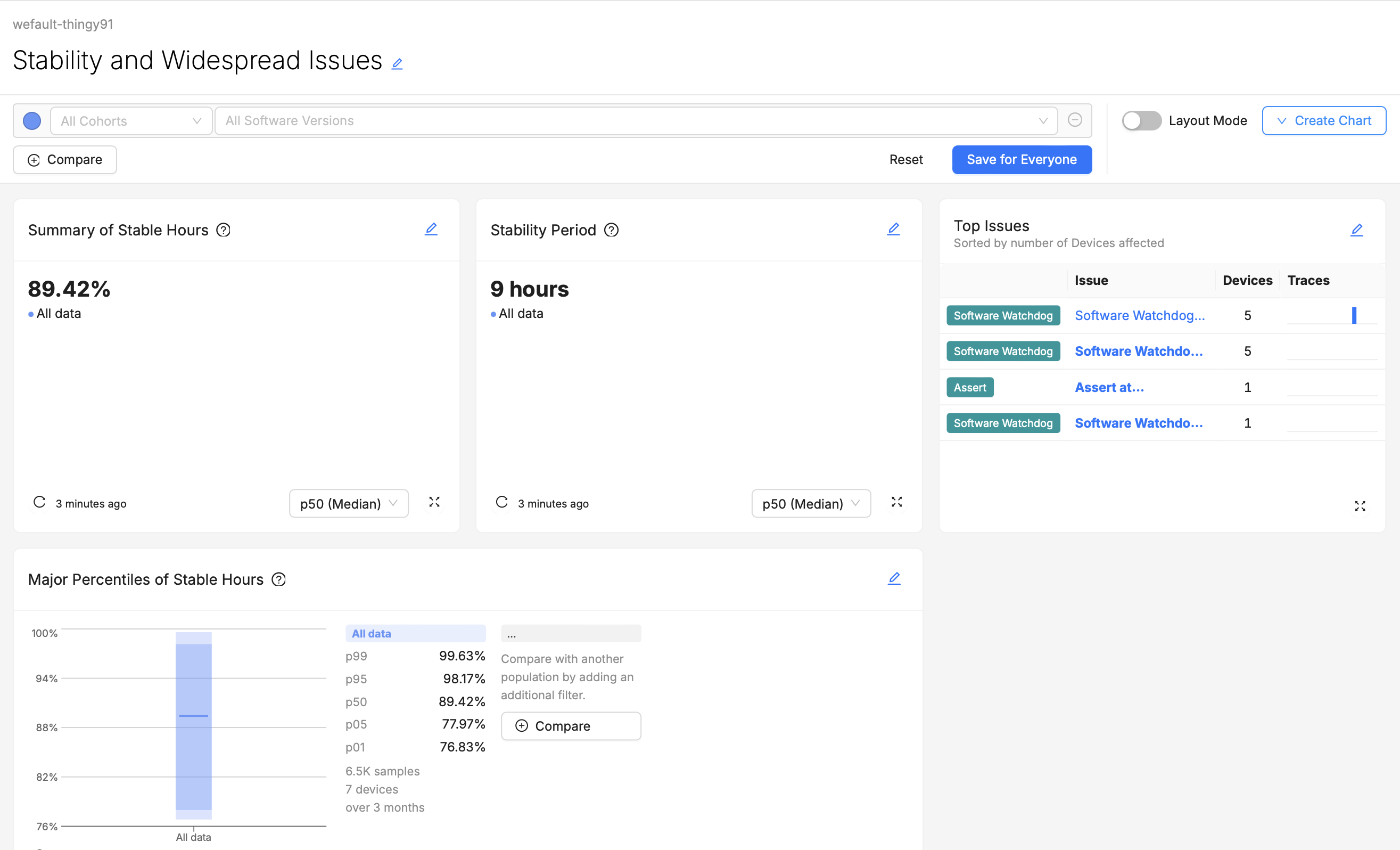
Group related metrics and visualizations together. For example, all visualizations related to device Stability might be grouped in one section, while another section (or even another dashboard) could focus on Connectivity monitoring. If users have to scroll up or down to find try and compare from two different visualizations that they wish were side-by-side, they may quickly become frustrated.
For example, the above screenshot shows a dashboard for users who are not only monitoring Stable Hours, but also triaging the spread of certain Software Watchdogs issues. Grouping Stable Hours Summaries and Top Issues charts together saves these users time.
Flow of Information
Arrange dashboard elements in a logical order that matches how your audience will use them. For technical dashboards, you might start with high-level overviews and move towards more detailed diagnostics. For executive dashboards, a top-down approach, starting with key performance indicators and moving towards supporting data, might be more appropriate.
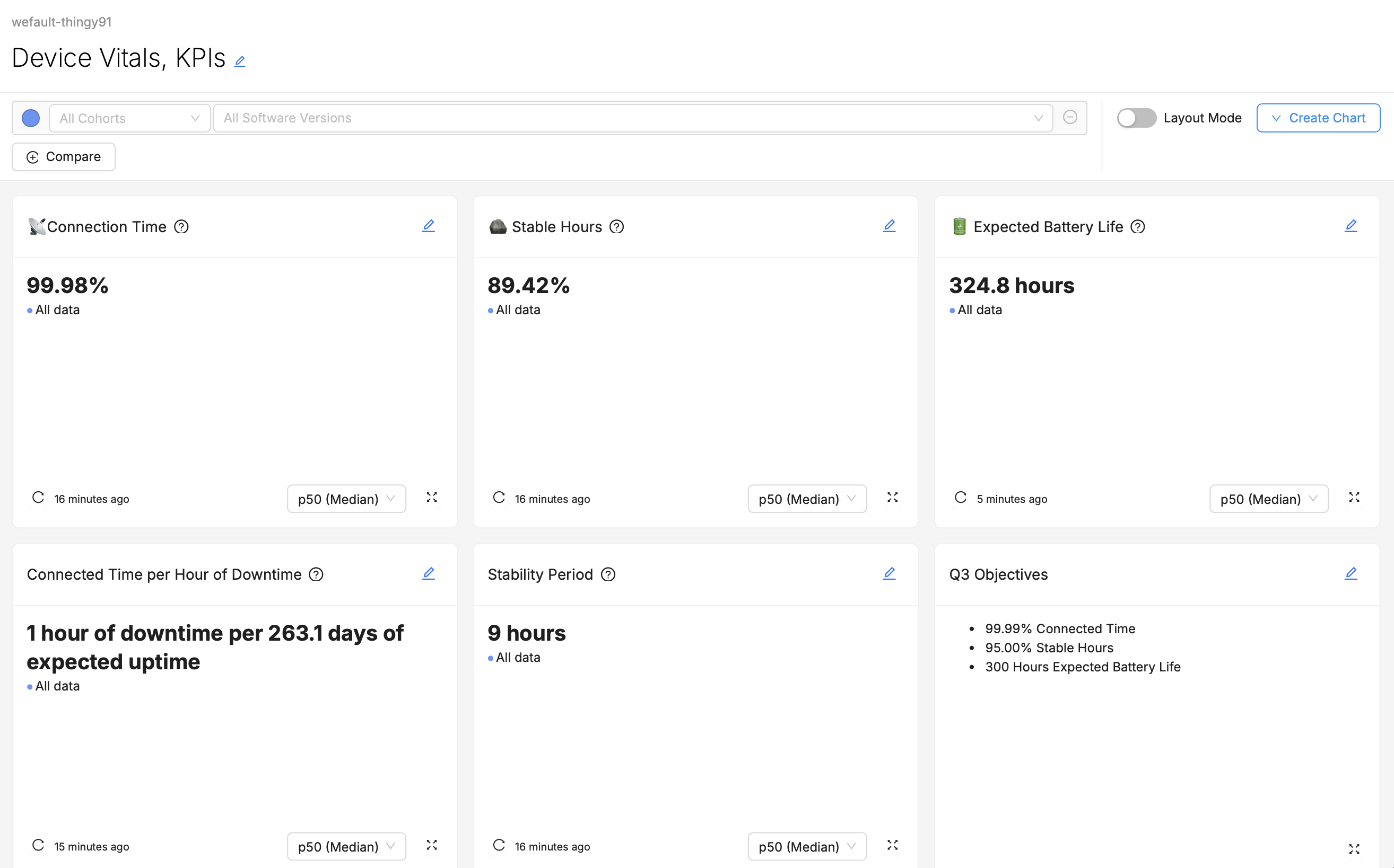
For example, the above screenshot of a dashboard might be designed for consumption by an executive, like a "Director of Firmware Engineering". While there may be important context behind these top-line figures, a busy executive may not want to be confronted with that right away. Including additional "Major Percentiles" charts or "Over Time" charts "below the fold" of the page may allow them to keep digging for further information and context if they want it, but if the top-line numbers look good, they may not feel the need.
Other Considerations
- Consistent Layout and Design: Use a consistent layout and design scheme throughout individual dashboards, and across your collection of dashboards as a whole. This will help users understand how to interpret and navigate dashboards they've never visited before.
- Readability: Ensure that all text, including labels, annotations, and Markdown content, is easy to read. Use legible and appropriate font sizes.
- Mix and Match Visualizations: While selection of visualization types and styles should primarily serve the interest of conveying the best possible understanding of the data, dashboards that overuse the same visual style may be difficult or tiresome to look at. For example, if every chart on a dashboard is the Major Percentiles visualization, it will be hard for users to differentiate charts at a glance. Using an appropriate variety of visualization types helps users quickly differentiate charts and can keep them more engaged.
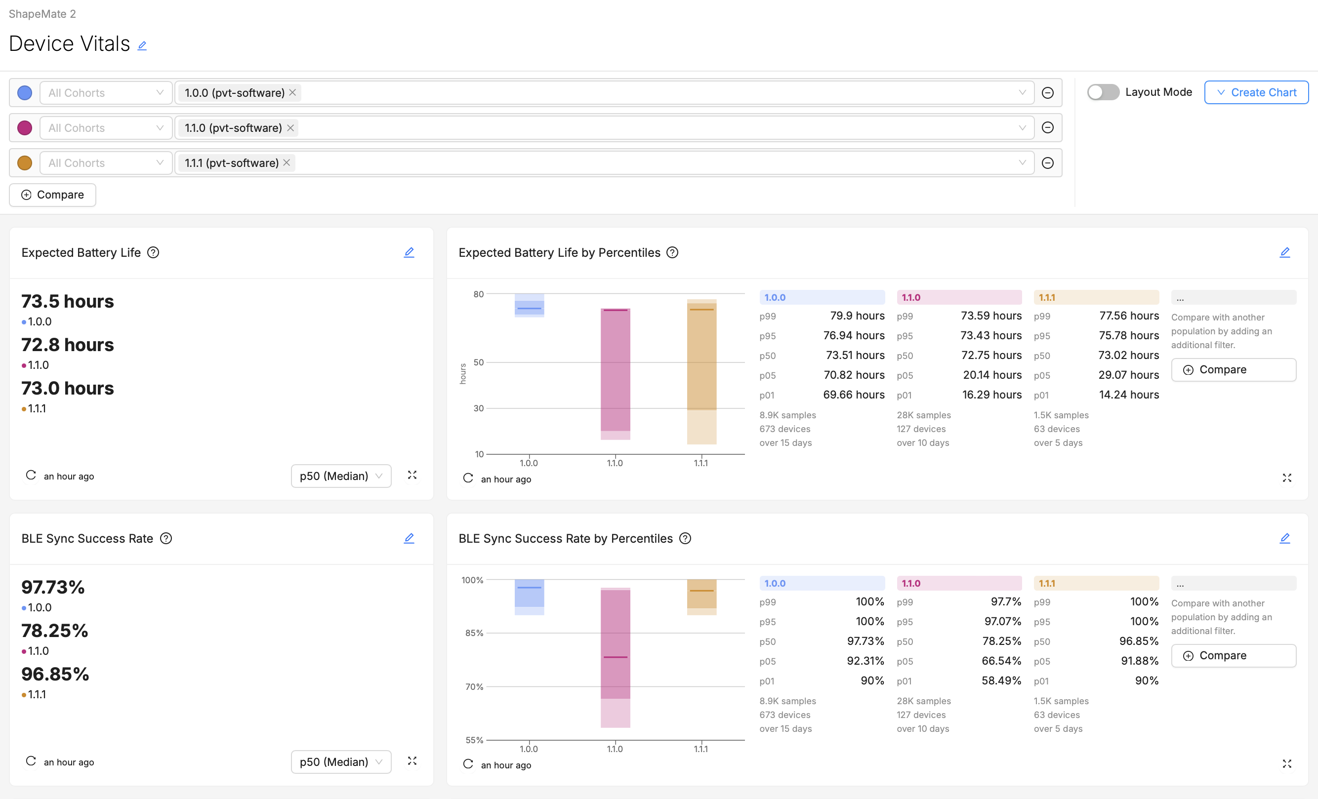
Example 1: A "Go/No-Go" Dashboard for a Release Manager
Audience:
- Release Manager
Likely Questions:
- "Is our newest firmware version safe to release to our entire production Cohort?"
- "Are there any noticeable regressions introduced in our newest firmware version?"
- "Does the change we've introduced in the firmware have the desired positive effect on our Device Vitals?"
Dashboard Layout:
Explanation:
- The Release Manager for whom this dashboard is intended wants to know - for certain Device Vitals like Stability and Battery Life - does their version that's currently in testing (1.1.0) improve on their most-installed production version, 1.0.0?
- They care about various percentiles of the population of devices, but their main go/no-go criteria all revolve around the being able to say that 95% of devices aren't experiencing a noticeable regression (in other words, that the performance of the p05 device is close to as good in the new version as it was in the old - clearly not happening in this example!).
- In the event that a regression does appear visible, they'll immediately want to know how widespread it appears to be (in this case the entire fleet does look more unstable), and whether there are any fluctuations over time that could account for this difference between versions. Then, they'll want to "drill down" into some of the troubled devices running the newest test version, to identify flag suitable cases for further testing and debugging to the rest of the firmware engineering team.
- They're very familiar with how these metrics are calculated and aggregated, so they don't require much in-line explanation of what the different charts are showing.
Example 2: A "KPI" Dashboard for Executives
Audience:
- Director of Firmware Engineering
- Chief Technology Officer
Likely Questions:
- "I'm presenting to the Board in a few hours, and I need to know: in general, are we hitting our KPIs this quarter? If not, are our newer software version releases getting us closer to our goals?"
- "Since perceived Connectivity issues result in the greatest number of RMAs, our number one concern is improving Connectivity. How frequently are our end-users experiencing downtime in their connection?"
- "Crashes are a less visible problem on our device, but still need to be kept within an acceptable margin. Is the device generally able to run a whole day without experiencing a crash?"
- "Does our Expected Battery Life still meet or exceed what we've promised to our customers?"
Dashboard Layout:
Explanation:
- The Executives for whom this dashboard is intended have a very clear idea of what their goals are, and the scores they want their product to achieve.
- If they have questions about why their fleet's Vital measurements are the way they are, perhaps they will scroll further down the page (maybe some Percentiles, Over Time, or Metrics charts help provide further context to these top-line numbers), but perhaps they won't, preferring instead to ask a Product Manager, Engineer, or someone else to explain why things look the way they do.
- They don't want to have to visit multiple different dashboards to gather these top-line numbers together, they'd prefer that it's all in one place, so that while jumping between back-to-back meetings they can spend as little time as possible grabbing this information.
- They're a technically-informed user, so they don't require any explanations of what the Vitals mean or how they are derived.
Conclusion
As you create and refine your dashboards, remember the importance of tailoring your approach to meet the needs of your specific audience, choosing the right visualizations to convey your data clearly, and organizing your dashboard components strategically for maximum impact. Utilizing Markdown cards for enhanced clarity and adopting a thoughtful composition strategy will further elevate the effectiveness of your dashboards.
As you put these principles into practice, we encourage you to experiment with different configurations, visualizations, and data points to discover what works best for your use-case and your team.
We invite you to share your experiences, successes, and challenges with the Memfault team and community.